Quantcast
Channel: A love for fountain pens, inks, and handwriting - Peninkcillin
Viewing all 82 articles
Browse latest View live

Diamine Green Black ink review

$
0
0
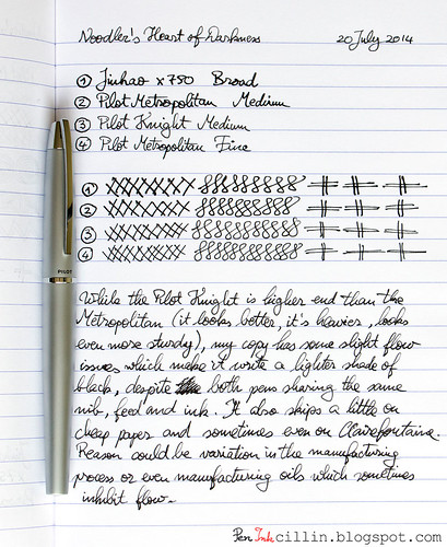
I know, I know, I promised that my next review would be from my collection of ink samples, based on the ink sample survey I ran a few weeks ago. I'm afraid I'm going to have to disappoint those who were expecting this, at least for another week. If you don't care why, skip the next paragraph.

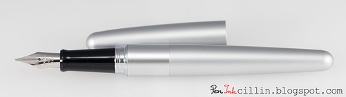
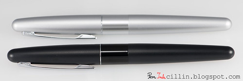
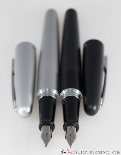
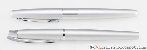
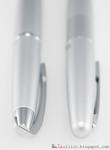
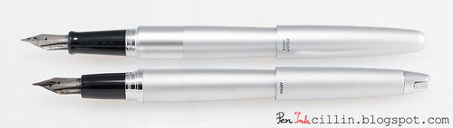
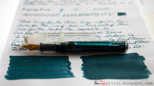
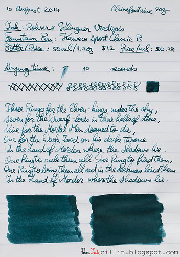
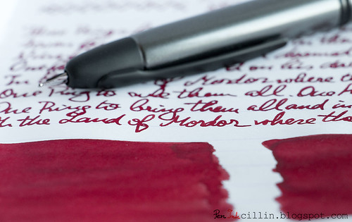
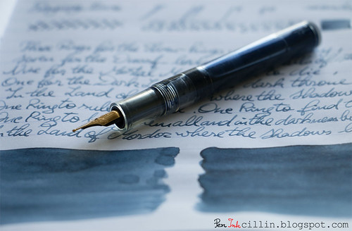
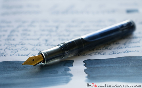
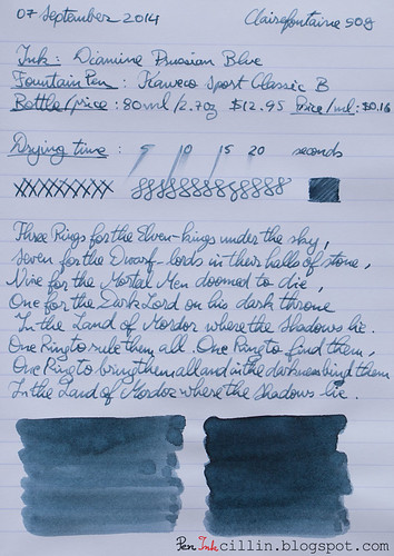
There's a rhyme and reason as to what fountain pens I use for my reviews. Lately, I've come to prefer the Kaweco Sport Classic for ink samples, for several reasons. First, it has a broad nib, which shows off the ink better but more importantly allows me to go through inks quicker. Second, it's a relatively inexpensive pen which I can use at work without fear of losing/breaking a nicer pen. Third, I use it as an eyedropper, which means that I can load it with the full 2ml from an ink sample. This allows me to exhaust a complete sample for each review. Well, today's review, Diamine Green Black, came in a bottle. Since my Lamy AL-Star was clean, I decided to load it up and do a quick review before I can finish the Waterman Blue in my Kaweco.

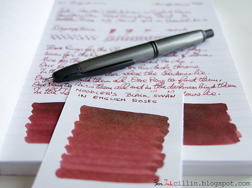
Today's ink, Diamine Green Black, comes courtesy of Jetpens. A while ago I tweeted this:
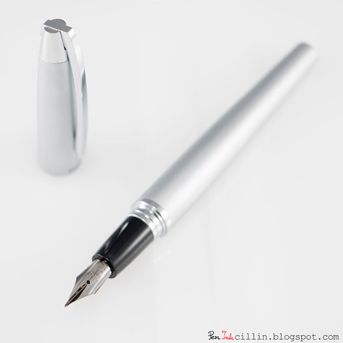
I just have this thing for British Racing Green, the color. So Jetpens suggested Diamine Green Black and were nice enough to send me a bottle for review. As soon as my Lamy AL-Star (with EF nib) was clean and dry, I loaded it up with Diamine Green Black and... let's see how well it performs.

Before we start, you might want to follow me on Twitter: @Peninkcillin.
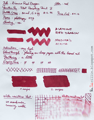
Bottle and pricing
My main beef with Diamine inks is that their box and bottle design is very plain and boring. Not only that but it's very hard to tell at a glance what ink is inside. No custom design, not even a color patch. Only a tiny sticker that weakly whispers the name of the ink. Even Noodler's bottles are cooler because all of them have custom graphics. That's such a shame because Diamine makes such great inks. Oh well, I'd rather have a great ink in a boring bottle than a lousy ink in a gorgeous package.

Diamine Green Black bottle

Diamine inks come in an 80ml / 2.7oz bottle and cost around $12.95 or $0.16 per milliliter, among the least expensive.

Color and saturation
Ah, now we're getting to the heart of the matter. The big question is: how closely does Diamine Green Black resemble the color British Racing Green? To my eyes, I would say a lot. I'm perfectly satisfied with this color. In fact, even if it was very far from BRG, I would still love it. I'll be honest: this is the best shade of green I've tested.

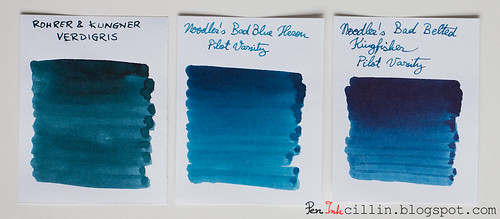
However, I decided to run a very non-scientific test to see just how similar the two colors are. So I did this little trick in Photoshop:

Diamine Green Black vs British Racing Green

I took the standard British Racing Green swatch and placed it between averaged (via blur) samples of Diamine Green Black. The first sample is 1 swipe with a q-tip while the second is 2 swipes. As you can see, BRG is actually lighter than both samples. Don't read too much into this though. For starters, consider that my samples are photographed and processed, which tends to alter the colors, while the BRG swatch is pure. Besides, the thickness of the ink sample can alter the averaged value considerably. Let's just leave it at that.

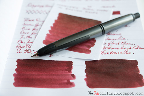
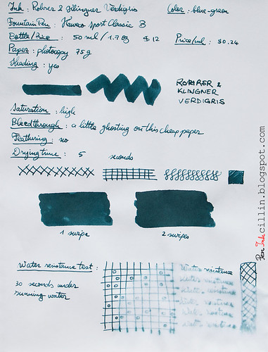
Color aside, you will notice that Diamine Green Black is a dark, saturated ink. The Green Black name is very appropriate. I feel that it can be successfully used in a professional setting. It looks even darker on glossy paper because more of it has the chance to pool on the surface before being absorbed.

Shading
Diamine Green Black doesn't disappoint and it features some decent amount of shading. The choice of paper will make a difference though, and this will come into play soon, as you will see. In other words, the shading is more visible on good paper and less so on cheap one.

Feathering
I was a bit surprised to notice that Diamine Green Black feathers a little on the cheap photocopy paper that I used for one of my test samples. It's not a lot but it's there. No such thing happens on Rhodia 80g. But then, not everybody uses their fountain pens on some of the cheapest paper available, so take that with a grain of sand.

Bleedthrough
Another small weakness, but wholly expected considering the poor quality of the paper and the darkness of the ink, is that it bleeds on cheap paper. You can still write on the reverse if you are using it as scrap but I would advise to try it before using it in any official document where bleeding might be an issue. Again, there's no bleeding on thicker/better paper such as Rhodia.

Flow, lubrication, and smoothness
In regards to flow and smoothness, things are looking very good. Diamine Green Black all but purrs when it flows through my Lamy AL-Star. It feels well lubricated, too. I would give it a 7-8 out of 10 for wetness. This also means that it dries differently, depending on the paper.

Drying time
Wet inks tend to dry quickly on poor, absorbent paper, and very slowly on glossy, high quality paper like the Rhodia 80g I used for one of the samples. On photocopy it dries within 5 seconds, while on Rhodia it takes its sweet time, at 20+ seconds.

Smearing when dry
None.

Water resistance
There isn't any water resistance to speak of, but perhaps contact with water wouldn't be a total disaster considering that some yellow undertones remained on the paper after the main green color washed off.

Conclusion
Diamine Green Black has been a very pleasant surprise for me. Not only does it resemble British Racing Green to some extent, but it is very smooth and wet flowing, with some solid shading. The two negatives, namely bleeding and a little feathering, aren't a big deal and they would be completely moot for those who prefer high quality paper anyway. Diamine Green Black is a beautiful ink. If you like dark green inks, do yourself a favor and try it. I doubt you'll be disappointed.

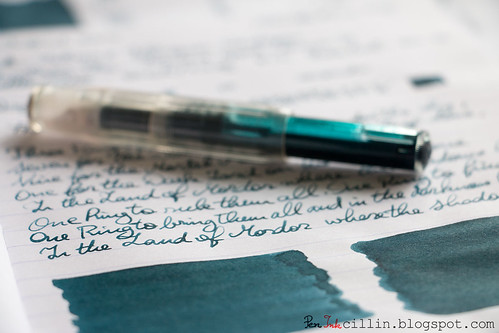
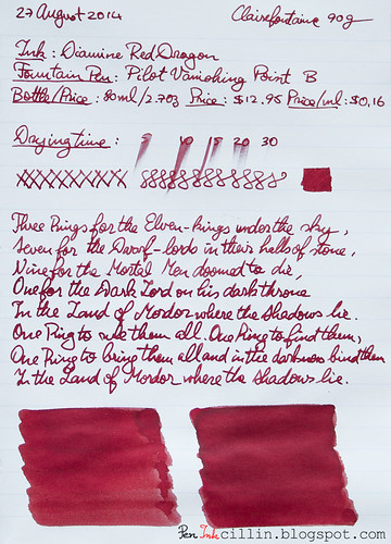
Following are the two samples, on photocopy and Rhodia 80g, respectively.

Diamine Green Black on photocopy

Diamine Green Black on Rhodia

Rohrer & Klingner Alt-Goldgrun ink review

$
0
0
Here I am, finally able to review one of the ink samples that I still have an abundance of. I asked you a while back if you would like to participate in my ink sample survey and the response was excellent. It was a good idea to hold a survey, if I say so myself.

So it turns out that Rohrer & Klingner Alt-Goldgrun came ahead of the other samples in the voting, which made it an easy choice to load in my Kaweco Sport Classic with broad nib and eyedropper conversion.

Is this ink deja-vu or what? We'll see soon enough.

Rohrer & Klingner Alt-Goldgrun with Kaweco Sport

Before I start, a couple of mentions.

First, I changed one of the review papers from Rhodia 80g to Clairefontaine 90g. My Rhodia notebook that I was using has finally filled up, allowing me to start a new Clairefontaine notebook, with even better paper. I'm already loving this paper more than the Rhodia. It seems to play really well with fountain pens. I might do a little paper comparison in a future post.

Second, I have joined two more social media networks, beside Twitter, since my last review: Pinterest and Instagram. If you decide to follow me on either of them, I'll follow you back. Click the links here or in the right sidebar -->

Bottle and pricing
Rohrer & Klingner Alt-Goldgrun comes in a 50ml / 1.7oz bottle which sells for $12. The price / ml is $0.24 which makes it more expensive than other inks.

Color and saturation
Did I mention deja-vu? Rohrer & Klingner Alt-Goldgrun reminds me strongly of J Herbin Vert Olive, of which I own a bottle. Vert Olive is lighter in color but both inks seem very closely related. They are both an olive sort of green.

Rohrer & Klingner Alt-Goldgrun vs J Herbin Vert Olive

To stretch the olive analogy farther, if Alt-Goldgrun is a ripe(r) olive, Very Olive is a green one. Apart from that, Alt-Goldgrun is darker and more saturated than Vert Olive.

Shading
Similarities to its J Herbin step-sibling don't simply stop at color. Alt-Goldgrun also features some very nice shading properties which are even more intense than the lighter ink. The Kaweco's broad nib really makes it stand out. Incidentally that's another reason why I prefer broader nibs.

Feathering
I'm sorry to say that Rohrer & Klingner Alt-Goldgrun feathers on cheap paper, which tends to act like a sponge. Combined with the broad nib, it's... not very pleasant. However, the problem all but disappears on good quality paper.

Bleedthrough
The situation here is similar to the feathering, in fact the two go hand in hand. Cheap paper is a sponge for Alt-Goldgrun, which causes it to bleed significantly. Personally it doesn't bother me too much because I use this ink at work to jot down notes and I use scrap photocopy paper. I can even use both sides because, well, I just hate wasting paper (and by association, trees). But if you're writing exclusively on better paper, like the Clairefontaine 90g I tested on, you won't have to worry about bleeding.

There is a bright side to this though, but not as you would imagine. Because the cheap paper I use literally sucks the ink out of that broad nib, my Kaweco is already empty after 4 days of use, which allows me to clean it and refill it with a new ink, hopefully to be reviewed next week.

Flow, lubrication, and smoothness
Rohrer & Klingner Alt-Goldgrun flows well in the Kaweco Classic and is wetter than average. On cheap paper it doesn't feel very smooth because of the sponge effect that I mentioned. On the plus side, it glides nicely on Clairefontaine.

Drying time
Drying on photocopy paper is nearly instant, but a somewhat longer (15-20 seconds) on Clairefontaine. Bear in mind though that this is with a broad nib. I'm sure it would dry quicker with a medium or fine nib.

Smearing when dry
None.

Water resistance
30 seconds exposure to running water completely destroyed this ink. Not. Water. Resistant.

Conclusion
Despite some flaws (feathering and bleedthrough) on cheap paper, Rohrer & Klingner Alt-Goldgrun is a fun and attractive ink. If I were to choose between it and J Herbin Vert Olive, I would choose Alt-Goldgrun, hands down. Vert Olive is too watery and too light for my taste, while Alt-Goldgrun is darker, and the shading is also better, which gives it more character and makes it more distinguished. If the olive type of green appeals to you, I would definitely recommend Rohrer & Klingner Alt-Goldgrun, with the caveat that it requires premium paper if you want to avoid potential frustration.

Rohrer & Klingner Alt-Goldgrun with Kaweco Sport eyedropper

Following are the two samples on photocopy and Clairefontaine 90g paper, respectively.

Rohrer & Klingner Alt-Goldgrun on photocopy

Rohrer & Klingner Alt-Goldgrun on Clairefontaine

Sailor Jentle Apricot ink review

$
0
0
As per my ink sample survey, I present you with the second ink you voted for: Sailor Jentle Apricot. In truth, this ink tied with 2 others, but I decided to review it first because, as you might (or might not) know, Sailor is discontinuing all their old inks, including this one, and replacing them with new ones which don't seem to bear much resemblance. There's a chance you can still find bottles of Sailor Jentle ink at some retailers if my review persuades you.

Once again, I reviewed this ink in my Kaweco Sport Classic, eyedropper mode.

Bottle and pricing
No longer relevant - discontinued.

Color and saturation
In my photocopy paper sample I wrote "Medium-High" for saturation and if you feel that this ink is definitely highly saturated, I won't blame you. To me eye, it feels less so than, for example, Diamine Orange, to which I have compared it side by side. The saturation is high but I've seen higher in other inks.

The color is an intense orange but there are visible differences compared to Diamine Orange. The Sailor ink is a truer orange while Diamine seems to contain a tad more red, making it more fiery in appearance. Below you will also see these two inks compared to Noodler's Dragon's Napalm, but this last one is very different from the first two: it looks a lot more pinkish-red.

Sailor Jentle Apricot compared

Shading
Sailor Jentle Apricot has the second-best shading among the orange inks I tested, after Iroshizuku Fuyu-gaki. Compared to Diamine Orange, which is flat, Jentle Apricot definitely shows some character.

Sailor Jentle Apricot shading

Feathering
Despite the broad nib of the Kaweco Sport, Sailor Jentle Apricot doesn't feather on cheap paper.

Bleedthrough
As is often the case with higher-than-average saturated inks, Sailor Jentle Apricot will ghost a little on cheap paper but you won't have to worry about that on the good stuff such as the Clairefontaine 90g I used for my other sample.

Flow, lubrication, and smoothness
Sailor Jentle Apricot feels pretty good in the Kaweco Sport. Broad nibs usually need a steady supply of ink and dryer inks might have issues but this wasn't the case at all with this ink. While it wasn't gushing, the flow felt very measured, which in turn gave better control of the nib on paper. As for smoothness, I have nothing to complain about. The pen doth not protest at all with this ink.

Drying time
Nothing out of the ordinary here. Dry times are a bit longish on Clairefontaine 90g, at around 25 seconds, but keep in mind the broad nib. On cheap paper that won't be an issue, at 5 seconds.

Smearing when dry
None.

Water resistance
Bottom line is that Sailor Jentle Apricot is not at all resistant to water. It did nothing to withstand 30 seconds under running water.

Conclusion
It's always sad to see a good line of inks being discontinued. Sailor probably has good reasons but I'm sure a lot of people are disappointed. While this may not be the best orange ink there is, it's certainly one of the better ones I've tested. While Iroshizuku Fuyu-gaki is more impressive and Diamine Orange more fiery, Sailor Jentle Apricot is actually a truer orange and features some shading, which the Diamine ink doesn't. Price-wise it is about halfway between Iroshizuku and Diamine. The other properties are pretty solid, and while none of them really stands out, they don't lag behind other inks either. Overall I'm pleased with this ink and with the chance to review it before it disappeared completely. I hope you can snag one if you fancy it, before it's gone!

The writing samples below are done on photocopy and Clairefontaine 90g paper, respectively.

Sailor Jentle Apricot on photocopy

Sailor Jentle Apricot on Clairefontaine

Bonus! My Instagram shot that I took while reviewing this ink.

May the Fourth be with you

$
0
0
May the Fourth be with you

Happy America Day folks and may the Fourth be with you, always!

Brought to you by TK-421 and his new Pilot Vanishing Point.

How to completely disassemble a Lamy Z24 converter

$
0
0
I've had my Lamy AL-Star fountain pen for a few years, along with the popular Z24 converter and while I love this pen, one thing kept me from using it more often in my rotation: the Z24 converter can be hard to clean. Ink likes to fill the recesses inside it, stick to the nooks and then dry up.

The last time I cleaned the converter, right after I finished the Diamine Green Black that was in it, it literally took me 15 minutes of flushing the Z24 over and over to realize that I wasn't going anywhere. As soon as I thought it was clean enough and shook it, out flew some more greenish water.

I decided that I had enough. I searched the internet for how to disassemble the Lamy Z24 converter and the only thing I could come up with was people assuring other people that it could be done, that they themselves had done it easily. Well, I tried in the past and failed. It seemed to me back then that the damn parts which make up the converter are fused together.

This time I used a different method and succeeded. What follows is a video (my first production video ever) of the procedure, as well as a written explanation with photos. Please excuse the amateurish quality of the video as well as my superglue-covered fingers. Also, please subscribe to my newly-minted Youtube channel if you wish, in the right sidebar.


What you're gonna need for the Z24 disassembly procedure is quite simple: a thin rod preferably made from plastic or wood, which can fit inside the converter, and your fingernails.

I used the plastic piston from an insulin syringe. I have a lot of them lying around, not because I'm diabetic but because I bought a pack of 100 a few years ago so I could use them to fill my cartridges, converters and fountain pens with ink. For this purpose the piston works wonderfully.


The first thing you want to do is to remove the black metal ring at the twisty knob end. This is easily removed by pulling outward with your fingers, perhaps twisting it a little if it feels stiff.


Now comes the tricky part. Underneath the metal ring you will notice that the red knob is mated to the black plastic piston assembly. This black part is actually the one that holds the piston inside the converter, and joins the knob and the piston. In the past I've tried pulling the assembly out with my fingers. Though my grip is pretty strong, I've never managed. The black part can be twisted but that doesn't help to extract it.

So I had to figure out a different way. This is where your nails come into action. Alternatively, you can use some sort of plastic shim, but I prefer the nails. I wouldn't recommend metal (like a knife blade for instance) because it will most likely damage the soft plastic of the converter.

You need to wedge your nail between the black part and the transparent converter body. Since the two parts seem melded together, it might help to bend the converter a little until a gap is formed between the two. At this point you should be able to slide your fingernail inside the gap.


You will now perform 2 simultaneous motions. First, you slide your fingernail along the gap, while rotating the black assembly (remember, this one is rather stiff to rotate). At the same time you pull outward with the other hand until the whole thing pops out.


There you go, the piston assembly has been removed from the transparent converter body. You can now unscrew the piston for cleaning but don't tell me I should have also detached the black assembly from the red knob because that would be pointless. Ink doesn't get between those parts anyway.


What remains is the small black ring/washer/valve/thing at the business end of the converter. This little part always bothered me the most because ink likes to accumulate between it and the walls of the converter, thus making it nigh impossible to wash the converter thoroughly. Well, not anymore buddy. Time to use the syringe piston.


Grab the syringe piston or whatever thin rod you have and stick it inside the converter. I would stay away from metal rods because, again, they could damage the soft plastic.


Brace the rod against the hard surface of a table and press down hard on the converter while pushing on the black washer thing until it pops out. Keep a finger or two on the opening because the sudden release could shoot it through the ceiling.


And there you have it. Taking the Lamy Z24 converter apart turns out to be a pretty simple procedure, but one which has eluded me for years. Now I'm hoping my method will bring relief to thousands of Lamy aficionados plagued by this very same conundrum.


I hope you have enjoyed this how-to and if you have a different method of doing this I'd love to hear about it in the comments.

De Atramentis Black Green ink review

$
0
0
Today's review marks a double-premiere: my first contact with the De Atramentis brand and the first partnership with one of my favorite pen shops, Goulet Pens, who were very kind to send me a bottle of De Atramentis Black Green ink. As a disclaimer I will have to mention that I received the ink for free but no other payment for this review, and all the opinions herein are my own.

I specifically asked the Goulets for this ink, among the (literally) hundreds they have, because I decided to try a new brand and also because I wanted to compare it to a very similar ink I tested recently, Diamine Green Black. The impressions of that ink are still fresh so De Atramentis Black Green proved to be a good choice.

Bottle and pricing
A bottle of De Atramentis Black Green is $12.50 and holds 35 ml / 1.2 oz. At $0.37 per milliliter it is rather expensive but that's what you get for an ink that's imported from Germany (despite the French-sounding name) and is allegedly hand-made. Hmm so that makes it a sort of German Noodler's? I bet they have more than one man running the show though.

De Atramentis Black Green bottle

The Noodler's comparison isn't entirely without merit because I can see some similarities in the style of the bottles, which are rather plain but neo-vintage looking, while sporting different art on the labels for each ink. The one thing that this ink is apparently missing is a box, but I guess the black bottle substitutes the role of light protection.

This particular ink is part of the Black Edition series of De Atramentis inks. This signifies that the bottle is tinted black, to prevent any light (UV or otherwise) from altering the ink. This also means that you can't see the ink inside the bottle which can be a bit of a bummer if you like to photograph the bottle in contre-jour fashion, like me.

Color and saturation
It's astonishing how similar De Atramentis Black Green and Diamine Green Black seem to be at first glance, especially since I tested both of them in my Lamy AL-Star with EF nib. If you start looking closer, you will start seeing plenty of small differences.

For starters, I think De Atramentis Black Green should be called De Atramentis Gray Green because it veers more towards gray than black. It is less saturated than the Diamine ink and also shades less, making it overall duller and more somber. In fact, it could just as well be called De Atramentis Khaki.

In the below comparison I added Diamine Graphite (which has hints of green) so you could see how the two green inks compare to a gray one.

De Atramentis Black Green compared with 2 inks

Shading
While the shading is not as pronounced as Diamine Green Black's, De Atramentis Black Green certainly has variation, and while it is subtle, it is more apparent on bright, smooth, high quality paper like the Clairefontaine 90g I tested on.

De Atramentis Black Green with Lamy AL-Star

Feathering
None.

Bleedthrough
On cheap paper it ghosts a little and may even bleed if you are a heavy writer like I am. No worries on good paper though.

Flow, lubrication, and smoothness
While nothing really stands out here in terms of wetness or smoothness, De Atramentis Black Green flows impeccably if not particularly wet. I'd give it a 6/10 for wetness but if you are looking for controlled flow, this might just be the ink for you.

De Atramentis Black Green with Lamy AL-Star

Drying time
On cheap paper it dries almost instantly, and within 10 seconds on Clairefontaint/Rhodia. That's pretty good, but remember it's not a wet ink and I used an EF nib.

Smearing when dry
None.

Water resistance
Now here's something that surprised me. Nowhere is this ink marked as water resistant. Yet, my standard dunk-it-for-1-minute-under-running-water test didn't phase it one bit. The sample remains completely readable after drying up, which puts it way ahead of Diamine Green Black in this aspect. Incidentally you can see how the dye components in the ink were broken up by the water: the green washed away while the gray remained.

Conclusion
For my first foray into the De Atramentis brand, I can say that I am generally pleased with De Atramentis Black Green Black Edition Deepwater Obsession (yes, this seems to be the full name). While not particularly remarkable, the performance is very solid, with no weak spots. As an unexpected perk, it seems to be more water resistant than most inks outside Noodler's specialized ones.

De Atramentis Black Green bottle

Personally, if I were to choose between De Atramentis Black Green and Diamine Green Black, I would go for the latter, but that's just because I prefer the slightly greener ink. However, there's no shortage of De Atramentis inks to choose from, and the Goulets have a wide variety of them, as well as a boatload of scented De Atramentis inks. I've already identified a few which look interesting. As for the scented ones, though I'm not in the habit of sniffing inks, they might be interesting to try.

The following samples are written on photocopy, and Clairefontaine 90g paper, respectively.

De Atramentis Black Green on photocopy

De Atramentis Black Green on Clairefontaine

Pilot Vanishing Point fountain pen review

$
0
0
In an unprecedented turn of events, a few weeks ago I was swayed by a sale that Amazon was having on Pilot Vanishing Point fountain pens, and decided to buy one. I had noticed the Vanishing Point and lusted for it for a long time but never dared spend so much money on a fountain pen. As a reminder, my most expensive pen up to the point was the TWSBI Diamond 530 for which I paid about $45 at the time.

I bought my Pilot VP in Gun Metal Gray, with a Broad nib, for $125. Unfortunately, the sale on Amazon is over but they still have decent prices (starting at $129.95 as of this writing) on certain combinations for these pens so if my review sways you to buy one, you can do me a kindness by following the affiliate link on Amazon to the Pilot Vanishing Point. It won't cost you any extra but I will get a few pennies from the sale.

Some may dislike the Gun Metal Gray combo but the reason I bought it in this configuration is because it's probably the safest one you can get. I would have preferred the Matte Black but I heard many stories that the finish likes to come off after a while. Gun Metal Gray is unassuming and pretty stealthy so it won't attract much attention if I decide to take it out in public. And my goodness how these pens are made just for taking out in public!

As for the nib, I tend to prefer broad nibs because of the usual reasons: I like to go through inks as quickly as possible so I can change them frequently, and broad nibs usually bring out the characteristics of the ink more, which is useful for my ink reviews.

So was the Pilot Vanishing Point worth all the expense? We shall find out together but the outlook is good.

Pilot VP elegance

What is the Pilot Vanishing Point?
For the few of you who still don't know what these pens are, and why they are special, let me give you a quick primer. Essentially they are fountain pens which behave like a click-button ballpoint pen. They don't have a cap. Instead, the nib hides inside the pen's body when not in use, and is extended by means of a click button, in a similar manner to that cheap Bic that costs a dime a dozen.

But what's the advantage of these fountain pens? Doesn't the nib dry out? Well, the biggest advantage (to me at least) is that you can pick up this pen and start writing in one swift movement, without having to go through the motions of removing the cap, storing or posting it, then re-capping when you're done writing. If you are in the habit of taking frequent short notes, this can be a lifesaver. There are no caps to lose and the pen's balance doesn't change in use because there are no removable parts. As for the nib, the ink won't dry because Pilot uses a clever mechanism whereupon a tiny internal door seals the opening when the nib is retracted.

Another side effect of this pen's design is that it can mess with people's brains, especially those who haven't encountered something like it before. But this can also be a curse, because I can almost see the clueless coworker who grabs one of these off your desk without permission, clicks the tip open and then starts jabbing at a page without even realizing that he's holding the nib upside down. I shudder to think.

Who is the Pilot Vanishing Point for?
The Pilot VP is for the discerning, modern fountain pen user. Well, not really. While to me the design and function looks modern, this type of pen has been produced in a slightly different guise for many years (see the Namiki Vanishing Point). There are even several different modern pens with a "vanishing point" or "capless" design, such as Pilot's own Fermo (roughly double the price of the VP) and even one that Lamy produced until recently (can't recall the name, sorry).

It's safe to say that if you are functioning in a dynamic environment, where you need to take notes at a moment's notice, and you like a more upscale fountain pen, this might be the instrument for you.

Packaging
For the money, I'm a bit underwhelmed by the packaging but on the other hand I'd prefer if it were even more basic, with the difference in cost rolled into the price of the pen. In truth, unless the pen costs hundreds or thousands of dollars, you most likely won't want to display it proudly anyway.

First, there's a sliding external cardboard box, which is elegant but simple. I really like the modern embossed design on it.

Pilot VP external box

Underneath is the actual box in which the Pilot Vanishing Point rests. This is a display-type snap-case with a faux leather finish. It's probably made out of cardboard.

Pilot VP internal case

You might notice some dust on the window. This pen must have been kept in storage for a long time because that's how I received it and the dust was nigh impossible to wipe off, perhaps due to the window being plastic.

Once you snap the case open, the beautiful Vanishing Point is revealed in its soft bed. Well, it was already revealed but you get the point.

Pilot VP in box

You'll notice the tag which says "Pilot Capless Broad Japan". The words "Vanishing Point" do appear on the UPC tag on the external box, as well as in the instruction manual, but not on this tag.

If you lift the insert by the silk ribbon you'll find more goodies hidden underneath. These include an instruction manual, a warranty card, but more importantly the CON-50 piston converter, a spare blue ink cartridge, and a blind cap for the cartridge. The Vanishing Point has a 3-year warranty and I'm actually going to mail in the warranty card, not because I'm afraid of anything going wrong but because it feels right to do so.

Pilot VP box contents

In the above photo I have already loaded the included ink cartridge. I could have gone with any of the inks in my collection but I thought it might be fitting to test it for the first time with Pilot/Namiki's own ink.

So the packaging is okay but not amazing. As a side-note, I really liked the neat box my Lamy AL-Star came in. Very simple and functional. Here are some beautiful pictures of the Lamy Safari's packaging on FPGeeks' website.

Body, construction, and dimensions
This gorgeous silver torpedo is rather thick, especially around the midsection, and then tapers at both ends. It really looks like a torpedo. Here it is compared to some of my other pens (TWSBI Diamond 530, Lamy AL-Star, Noodler's Ahab, Pilot Prera):

Pilot VP length

The length is 5.5 inches (14cm), and that's about the same as a capped Lamy Safari/AL-Star or Noodler's Ahab. Maximum thickness is about 0.5 inch (1.27cm), comparable to a TWSBI 530/540/580 or a Noodler's Ahab.

Here are the weights compared for the pens in the above image:

Pilot Vanishing Point (with cartridge and blind cap) - 30.5g - 1.08oz
TWSBI 530 (no ink) - 25.7g - 0.91oz
Lamy AL-Star (with converter) - 21.8g - 0.77oz
Noodler's Ahab (no ink) - 18.8g - 0.66oz
Pilot Prera (with converter) - 16.1g - 0.56oz

As you can see, it is weightier than all of these pens, and you can feel it. You are really holding a large chunk of metal. In fairness, the other pens aren't metal, except for the Lamy which is aluminum, but the VP is made of a denser metal.

The Pilot Vanishing Point may not appeal to everybody due to the peculiarity that it has the clip at the nib end, as opposed to the butt end where most pens have it. But that, of course, is because it lacks a cap. Still, don't ballpoint pens have the clip at the plunger end? Yes, but the VP is a fountain pen and positioning the clip like that ensures the pen will sit with the nib upright when clipped to a shirt pocket. That way there's no risk of ink leaking into your shirt.

Pilot VP

The position of the clip may render the pen uncomfortable for some, but don't knock it until you try it. I took a calculated risk when buying this pen and it paid off. The clip position doesn't intrude at all, in fact it helps me hold the pen with the nib pointed in the right direction. I can basically grab it from the table, click it open and start writing without glancing at the tip to see if it is aligned properly.

The clip is spring-loaded, with medium stiffness. I haven't actually clipped it to a shirt pocket because it's still sitting on my home office desk.

Balance is damn near perfect, with the weight centered around the lower half, where you're holding it, which prevents it from being top-heavy.

Pilot VP in hand

The barrel is made of two sections, one containing the plunger, the other containing the nib end and the clip. While the body is metal, the Gun Metal Gray finish is not the bare metal. It is glossy and resembles some sort of lacquer. The black trimmings are painted matte, with the exception of the two gloss black rings which join the sections.

Pilot VP

One of the cool things about the Pilot VP is the nib unit itself. It is like a miniature self-contained fountain pen (without the cap) which resides inside a larger pen, like a set of Russian dolls.

Pilot VP nib unit with converter

If you wish, you can simply grab the nib unit and start using it like a fountain pen. It's just that you might find it rather thin. The big advantage is that you can dip the nib (which is longer than the average nib) into an ink bottle and avoid getting the rest of the pen (section, barrel, etc) dirty. The nib unit fits inside the pen body one way only, constrained by the notch shown below. This ensures it is aligned properly with the exit hole.

Pilot VP cartridge loaded

Operation
The Pilot Vanishing Point is operated via the plunger, like any ballpoint pen. Notice how long the plunger is. That's most likely because the nib needs to extend farther than a ballpoint tip.

As you press the plunger, a small gate - acting as an internal cap which seals the nib - retracts, just as the nib pushes past it. Here's how the process looks.

Pilot VP in action

This mechanism is incredibly smooth, unobtrusive and efficient. My pen hasn't dried one bit since I got it a few weeks ago, despite not getting a lot of use.

The plunger rattles a little when active but it's barely noticeable.

A closer look at the nib
The nib in the Pilot Vanishing Point is much narrower, but also longer, than a regular nib. Mine is a Broad and apparently it is 18k gold, whatever that means. It's probably gold plated because I doubt it's solid gold at this price. Someone correct me if I'm wrong.

Pilot VP nib unit

Pilot VP nib

Here's how the nib and the feed look when extended.

Pilot VP nib and feed

I can understand people who dislike the appearance. If you give it too much thought it does look like an ugly little thing. I prefer too see it as a very fancy ballpoint/rollerball tip instead.

Here it is compared to the broad nibs in the TWSBI Diamond 530 and Kaweco Sport Classic.

Pilot VP, TWSBI 530, Kaweco Sport nibs

And again compared only to the TWSBI 530.

Pilot VP vs TWSBI 530

Notice that the size of the tipping for all three nibs is pretty much identical. And so is the line they produce, though each pen has its unique personality.

One thing worth mentioning is that the nib never dried up on me when exposed, not even during several prolonged photo sessions. I've never quite encountered this in other nibs. I don't know if there's a special trick that Pilot employs or it's just happenstance.

But does it write?
It writes, and well it does. This is one of the smoothest broad nibs I've used, even slightly more so than the TWSBI 530's, which is a superlative nib in itself.

Pilot VP writing sample

On paper it glides like a hot knife through butter (pardon the oft-used metaphor). Any paper. The sample above is Clairefontaine 90g, but cheap copy paper doesn't phase this nib at all. On both papers it almost feels like there's an air cushion between the surface and the nib.

To be honest, I was expecting this Japanese broad nib to be more like a European medium. I was wrong. The line is just as wide as the TWSBI's and Kaweco's German nibs. The VP nib is, however, slightly smoother than the TWSBI and a lot more than the Kaweco. It turns out that Japanese broad nibs aren't very different from other broads after all.

You might be curious about the springiness of this nib and I can tell you that it likes to flex a little. It's obviously not a flex nib but it is far from a stiff nail. In fact, the springiness allows it to imbue some extra line variation if a little pressure is applied. Check out this poor quality Instagram shot that I took while typing this paragraph.


Flow can always be a deal-breaker but this is certainly not the case here. The unit supplies the nib with plenty of ink, in a very controlled manner. I've never encountered a hard start or any skipping whatsoever. When I click it, it's ready to go. I feel supremely confident that it won't spit ink but at the same time it will lay a nice, fat, wet line, just the way I like it. On the other hand, cheap paper does not a great partner make, as it likes to suck in all that extra ink like a sponge.

While I like the nib and would buy it all over again if I had the chance, I'm already thinking about potentially acquiring a medium nib unit to complement this one. I like broad nibs because they go through inks quickly and show off the ink shading nicely, but for journaling or more official note-taking, a thinner nib might be more appropriate. Besides, it might be fun to keep different inks in each nib unit and swap them when the need arises, though I would have to figure out how to store and keep them from drying.

A quick word about Pilot's ink
While I'm usually quick to dismiss the ink cartridges that are sometimes included with fountain pens, I have to admit that Pilot/Namiki's blue ink is quite excellent. Not only is it a pleasant, saturated blue, but it actually features some very decent shading, which allows the broad nib in the VP to shine even more. Here are two close-ups of the writing sample.

Pilot VP writing sample 3

Pilot VP writing sample 2

Of course, you would expect such an ink to work perfectly with the pen it accompanies, and perhaps that's partly why the pen writes so smoothly. On second thoughts, that might also be a reason why it doesn't dry out when the nib is exposed for such a long time. Either way, I'm very pleased with the blue Pilot ink cartridge. In the end, I still can't wait to finish it so I can try other inks in this pen.

Final words
The Pilot Vanishing Point is my most expensive fountain pen to date, and though it took some courage to buy it, I am very glad I did. I don't regret the choice of the broad nib either. The Vanishing Point is so different than any other pen I own, but its design makes it more practical and durable than all the others. It is stealthy, yet recognizable. The build and mechanism are tuned with Japanese precision. The nib, oh boy is it smooth! And it flows so well that it makes me forget all the hard starts and skipping issues I had with lesser pens.

In short, I feel that this freshly kindled love for the Pilot Vanishing Point will burn bright for many years. But aren't there any negatives, you might ask? None whatsoever. But then love is blind and I'm just a little biased.

Pilot VP elegance

Pilot Metropolitan fountain pen review

$
0
0
Thanks to Goulet Pens who sent me these pens for review, I can present you with two Pilot Metropolitan fountain pens, one plain silver with medium nib, the other plain black with fine nib. Disclaimer: I received the pens free of charge but no other payment or incentive for this review, and all the opinions herein are my own.

There are several different patterns available for the trim piece around the mid-section of these pens, as well as gold and purple finishes, but I opted for the plain versions because I wasn't sure I would like the patterns. Looking more carefully at the photos on Goulet Pens I believe that some of them, such as the silver dots, are quite interesting.

The Pilot Metropolitan must be a new model because I can't remember hearing about it a year ago. It certainly wasn't available when I got into fountain pens, around 2010-11, because instead of the much more expensive Pilot Prera, I might have looked into one of these instead. As it stands, the Pilot Metropolitan is a very affordable entry-level fountain pen which the Goulets sell for a modest $15. Let's dig in and find out what you get for 3 Lincolns.

Packaging
The Pilot Metropolitan comes in a simple but neat exterior cardboard sleeve. Inside is the inner display case which is made of some sort of thin metal or tin, with a plastic window through which the pen and a blue ink cartridge can be seen.

Pilot Metropolitan external box

Pilot Metropolitan internal box

This is quite a lot of decent quality packaging for a $15 pen. I actually prefer it to that of the Pilot Vanishing Point. This case looks sturdier and the metal is superior to the VP's fake-leather-covered-cardboard.

Here's what the case looks with the lid open. Pilot also includes a blue ink cartridge to get you started.

Pilot Metropolitan internal box open

Body, construction, and dimensions
The Pilot Metropolitan is a sleek, metal-bodied fountain pen, with a slim cigar-shaped body. It tapers to a rounded point at both ends and there's no finial to speak of.

Pilot Metropolitan silver

The silver version comes with a brushed metal finish, while the wide trim band around the middle is polished aluminum. The middle band can also be one of several patterns, such as dots, python, zig-zag and so on.

Regardless of color and finish, all Metropolitan pens sport a polished chrome clip which seems to be tension-loaded. It's very plain and I can't say I like it but it serves its purpose.

Moving on, uncapping the pen reveals the glossy black plastic section and the nib.

Pilot Metropolitan silver uncapped

The cap is of the slip-on type and snaps close with a solid click. You can post the cap but it doesn't feel very secure unless you press it down hard. I prefer to use the Metropolitan un-posted because the balance feels better for me. Posted, it's a little top heavy.

Pilot Metropolitan posted

Seeing the nib, immediately hinted that this would be a good writer. Why? Because at first sight the nib looked very similar to the Prera's. And the Prera is a very good writer. So are the nibs identical? I will reveal that shortly.

Unscrewing the barrel from the section reveals the filling mechanism. It's a squeeze converter.

Pilot Metropolitan silver disassembled

Now, I have some reservations regarding squeeze converters. They're rather imprecise when filling, you can't see the contents, ink capacity is low and, well, basically they're not the most elegant filling system out there. But considering the price of this pen, I'm actually glad that they even included a converter. Other manufacturers won't even dream of going beyond the courtesy lone cartridge for price points below $40-50. So I see this as a big plus.

Pilot Metropolitan silver and black disassembled

Here are the two pens I reviewed, next to each other. The black has a fine nib, while the silver sports a medium.

Pilot Metropolitan silver and black

The black pen has a similar brushed finish, but the black band is glossier than the silver.

Dimensions for the Pilot Metropolitan are as follows:

Length capped: 13.7 cm / 5.4 in
Length un-capped: 13 cm / 5 in
Length posted: 15.5 cm / 6 in
Weight (capped, with converter): 26.4 g / 0.93 oz
Weight (un-capped, with converter): 17.1 g / 0.6 oz

Here are the two Metropolitans compared to the Prera. They are longer but slimmer. I prefer the Prera's shape though, but that's a more premium pen.

Capped Pilot Metropolitan black and silver vs Prera

In operation, the Metropolitan is well balanced without posting the cap. While I would prefer a slightly thicker body, it is by no means uncomfortable. The glossy section is a bit slippery but the fingers won't slide too low because they are stopped by the flared end.

The nib
As mentioned, as soon as I saw the Metropolitan's nib, I knew it would be good, because it looked very similar to the Prera's. So I took both pens apart (the medium-nibbed Metropolitan and the medium Prera) and here's what I saw.

Pilot Metropolitan vs Prera nib and feed

As I suspected, both nib and feed are identical. The only difference is in the pattern which appears on the nib. The Metropolitan has a small dashed design, while the Prera lacks this, instead featuring the words "Super Quality". Well, I'm happy to report that both nibs are "super quality".

Here's the underside of the two feeds. Again, they are identical, except for the fact that the Metropolitan's is a lighter color.

Pilot Metropolitan vs Prera nib and feed

Next is a series of photos comparing the fine nib from the black Metropolitan with the medium nib from the silver Metropolitan, and the medium nib from the Prera.

Pilot Metropolitan silver and black nibs

Pilot Metropolitan silver and black nibs close-up

Pilot Metropolitan nib vs Prera

Pilot Metropolitan black vs Prera

Pilot Metropolitan silver vs Prera

You can tell just by looking at these photos how much thinner the fine nib is compared to the medium.

But do they write?
Expectations can be low for inexpensive pens and high for expensive ones. My expectations for the Metropolitan were pretty high to start with but I'm happy to say that they were exceeded. I loaded both pens with Noodler's Heart of Darkness and also used a Jinhao X750 with a broad nib for comparison, filled with the same ink.

The medium nib in particular impressed me in no small measure. It writes better than the Prera. I suspect I was lucky to get a particularly good sample. This is without doubt the smoothest medium nib I have used. It writes like a dream, creamy smooth on any type of paper. It's so smooth, and the flow so satisfying that it resembles a Pilot V5 Rollerball. Scratch that, it's even smoother than the V5.

The medium nib's flow is well on the wet side with Noodler's HOD, but be rest assured that it doesn't gush. Since I like wet-flowing nibs, it is very enjoyable to use.

The fine nib has a different character. It is very smooth and the flow is consistent. It starts right away and never skips. Yet, due to the nature of the nib, it is not quite as smooth or as wet as the medium. Don't get me wrong, if the medium gets a 10/10 for smoothness, I'd give the fine a 8.5-9/10. Same for wetness.

The fine nib's strength lies in its precision. It lays a very thin and sharp line, which I'm sure would be perfect for Japanese or Chinese characters. If you like F/EF nibs, this is the nib for you. Myself, I prefer a thicker nib, that's why I favor the medium, but the fine is just as good, depending how you lean.

Both nibs require very little pressure to write.

Here's the writing sample on Clairefontaine 90g, showing a comparison between the Pilot Metropolitan M and F, as well as the Jinhao X750 B, followed by a couple more glamour shots.

Writing sample for Pilot Metropolitan

Pilot Metropolitan silver and black with writing sample

Pilot Metropolitan silver and black with writing sample

Notice how much tighter the spiral designs are with the F. Both pens pair incredibly well with Noodler's Heart of Darkness.

Final words
The Pilot Metropolitan is an inexpensive but definitely not cheap fountain pen. $15 gets you a stylish metal body with good balance and decent ergonomics, and even a squeeze converter which is pretty rare at this price point. But more importantly, this entry-level fountain pen comes with an incredible nib which puts more expensive pens to shame.

I can't recommend the Metropolitan strongly enough but it's up to you to decide which nib size you prefer. While both are amazing, my own bias makes me lean towards the medium. Whichever way you go, there's only a big heap of win, so if my review convinced you, head on to Goulet Pens and take a look.

Diamine Syrah ink review

$
0
0
The next ink from my ink sample survey, which got equal votes to Rohrer & Klingner Alt-Goldgrun, is Diamine Syrah. This ink is perfect for today's review because it is similar to the subject of a recent controversy: the change in formula for Noodler's Black Swan in Australian Roses (aka BSAR). As a result, I reviewed both inks in parallel. You will notice a comparison to Noodler's ink (original formula) in one of my samples but the actual review for that ink will be posted some time next week.

I reviewed Diamine Syrah in my Kaweco Sport Classic with broad nib and eyedropper conversion.

Diamine Syrah shading

Bottle and pricing
Diamine inks typically come in 80 ml / 2.7 oz bottles, selling for $12.95, or $0.16 per milliliter. Very affordable. I only had a sample of Diamine Syrah at my disposal, hence the lack of bottle pictures.

One thing that I'd like to mention here is that this ink stained my sample vial such that it didn't wash off with just water like most inks. Not a big deal, obviously, but worth keeping in mind.

Color and saturation
Diamine Syrah is a beautiful burgundy ink, of a deep and dark shade, very reminiscent of a good vintage wine. I couldn't get it to look so good if I poured actual wine in my Kaweco. Too bad it doesn't have the fragrance and bouquet of wine.

It is a very saturated ink and you will notice that it is a darker shade of burgundy than Noodler's Black Swan in Australian Roses (original formula). In reality, it depends how you sample the inks. On cheap photocopy paper, Noodler's BSAR appears lighter, almost pinkish, but on Clairefontaine 100g sketch paper it is much darker, which makes it very similar to Diamine Syrah. In actual use, BSAR is lighter on paper. This will be revealed in my review of Noodler's BSAR.

Diamine Syrah vs Sailor Jentle Grenade

At the same time, I compared Diamine Syrah with the only other burgundy ink I tested: Sailor Jentle Grenade. I'll have to admit that Sailor's ink is even more beautiful, with really wild shading and even some golden sheen. There's slightly more red in Sailor's ink, but apart from that, the two inks are fairly similar, more so than Syrah vs BSAR.

For good measure I also threw in a sample of Waterman Havana Brown (see at the bottom of the article) because it's a brown ink with some red in it but it actually doesn't help this review much.

Shading
Diamine Syrah has some very nice ink variation, otherwise known as shading. It is not as good as Sailor Jentle Grenade though. I can actually see Grenade's sheen with the naked eye in the handwriting, never mind the color swab. Still, Syrah has some of the better shading inks I've tested.

For the ink variation to "shine", a broad(er) nib is indicated.

Diamine Syrah shading

Feathering
None.

Bleedthrough
As usual, such a dark, saturated ink will most certainly ghost on cheap paper and even bleed if the line is wet enough. It doesn't do any of that on Clairefontaine 90g though.

Flow, lubrication, and smoothness
Diamine Syrah flows well in the Kaweco Sport, despite the broad nib. Paradoxically, it also feels a bit dry on cheap, absorbent paper. Having used it for the past week at work taking notes on scrap photocopy paper, flow is not always consistent. Sometimes it skips and sometimes the line is too thin. This could also be a result of my style of writing, which can often be rushed. If I press harder on the nib and take my time, it seems to flow much better.

On Clairefontaine 90g it glides smoothly, without any of the above issues.

I can't even be sure if this is an ink issue, or a paper issue, or a fountain pen issue. Basically Diamine Syrah is on the wet side but shows dry tendencies under certain conditions which are hard to pinpoint. Either way, it is not a serious problem.

Drying time
Drying times are long on Clairefontaine 90g with the broad nib (a little over 30 seconds), but that's entirely expected. Cheap paper absorbs it quickly and renders it dry in under 10 seconds.

Smearing when dry
None, with the mention that you will have to give it a very long period of time on good, shiny paper, before you can touch it without smearing. A lot of dark, saturated inks behave this way.

Water resistance
This is by no means a water resistant ink but it seems to not be a total pushover like other inks, either. 30 seconds under running water washed some of it off but the text and diagrams appear recoverable.

Conclusion
Diamine Syrah is a really cool looking burgundy ink with excellent shading and amazing looks. In typical Diamine fashion, it is generally a well-behaved ink and inexpensive to boot. If you enjoy your red wine, you'll very likely enjoy Diamine Syrah. Give it a try, you won't regret it!

Following are the two writing samples on photocopy, and Clairefontaine 90g paper, respectively.

Diamine Syrah on photocopy

Diamine Syrah on Clairefontaine

Ink samples (5x) GIVEAWAY

$
0
0
This past week I reached my first 300 followers, after 170 days on Twitter. I am both happy and humbled by this, since I had no idea what might come out of my Twitter presence. I used to be a social media luddite until recently, but things changed when I realized that instead of viewing social media as another time-wasting internet fad, it's much more lucrative to see it as a tool.

Though I'm not on Facebook (which I don't see as relevant for my blog, especially since I'm not a business), I've come to see Twitter, Instagram, and Pinterest as very powerful tools that can expand one's audience, fans, and connections for a particular subject. In my case, the subject includes inks, fountain pens, calligraphy and handwriting, and stationery in general.

I try not to tweet about subjects that are not relevant to the above. On the other hand, I'm more lenient on Instagram, where I've been known to post pictures of things that I cook for myself or other stuff that I might find interesting. Still, the majority of my focus is on the bread and butter of this blog.

To celebrate my 300-follower milestone, I decided to give away 5 ink samples from my ink collection of 15 inks, to one lucky participant. I'm grateful and humbled by all the attention and support I've been getting since this blog launched, and this is my small way of thanking you, my readers. Unfortunately I can't give more than 1 prize at this point, but hopefully there will be other milestones down the road which I can celebrate with more giveaways.

Also unfortunately, this giveaway will be valid only for US residents (including Alaska and Hawaii), because otherwise the shipping would be prohibitive.


Here's a list of 15 inks that you can pick from. Notice that next to each ink there's a quantity in milliliters. This signifies the maximum amount that I will give out from each ink. Some inks I have more of, others less, hence the disparity.

You can check out my reviews for each ink by following the links.
  1. De Atramentis Black Green (3 ml)
  2. Diamine Green Black (2 ml)
  3. Diamine Orange (3 ml)
  4. J Herbin 1670 Bleu Ocean (3 ml)
  5. J Herbin 1670 Rouge Hematite (2 ml)
  6. J Herbin Vert Olive (2 ml)
  7. Iroshizuku Fuyu-Gaki (2 ml)
  8. Monteverde Brown (2 ml)
  9. Noodler's Heart of Darkness (3 ml)
  10. Noodler's Gruene Cactus Eel (3 ml)
  11. Noodler's Navajo Turquoise (3 ml)
  12. Noodler's Nikita (5 ml)
  13. Noodler's Polar Brown (2 ml)
  14. Waterman Florida Blue (3 ml)
  15. Waterman Havana Brown (2 ml)

How to participate

I chose to use Google Forms to collect your information. I've been suggested ROFLcopter or some such but I don't really trust these 3rd party services and Google Docs is already integrated with Blogger, not to mention incredibly easy to work with, so in the end it was a no-brainer.

Head on to the giveaway form and please fill in the required fields.

I will need a name/nickname/screen name, so I can announce the winner by it. It doesn't have to be your real name, just something that you will recognize when I make the announcement. I will also need a valid email address so I can ask for your mailing address if you win. Not least, you will need to pick 5 inks (no more, no less).

Submissions are open until Saturday, August 9th, 12:00 AM CST. I will most likely announce a winner on Sunday, August 10th.

How to increase your chances to win

There are 2 additional ways in which you can increase your chances to win.
  1. Follow me (@peninkcillin) on Instagram and post a relevant picture with the tag #picgiveaway1. The picture should be related to the subject of this blog (ink / fountain pen / handwriting / stationery).
  2. Follow me (@peninkcillin) on Twitter and re-tweet the giveaway tweet (which will contain the tag #picgiveaway1).

Rules for participating/winning

  • The giveaway is US-only, really sorry about this :(
  • You can pick no more, nor less, than 5 inks.
  • The giveaway won't cost you a thing - I will ship the 5 samples for free.
  • Winners will be drawn at random from the list compiled from the giveaway form  + Instagram + Twitter participants. Submitting entries on Instagram and/or Twitter will increase your chances to win. I will use a popular online random number generator to pick the winner.
  • The draw will take place 2 weeks after the giveaway is announced.
  • You will be disqualified if: your data is incomplete, OR the email address is invalid, OR you are outside the US, OR you re-tweet or post on Instagram without following me, OR you re-tweet the wrong thing, OR the Instagram picture is not according to the guidelines listed above.
  • If I contact you and you don't respond to my request for a mailing address within a week of the drawing, you will be disqualified and another drawing will be held.
  • Once I obtain your mailing address I will ship the 5 samples you picked within 5 business days.
  • I will ship via USPS Domestic Flat Rate so theoretically you should be OK if you are inside the US.

Final words

If you win and write/draw something cool with the inks I sent you, and post it online, feel free to let me know so I can tweet it or otherwise broadcast it.

Good luck and may the ink gods be on your side!

Pilot Knight fountain pen review

$
0
0
My new friends at Pen Chalet sent me a very nice fountain pen to review: the Pilot Knight. Like the Metropolitan, this is a newer release from Pilot. Disclaimer: I received the pen free of charge but no other payment or incentive for this review, and all the opinions herein are my own.

For now, the Pilot Knight comes only in brushed silver finish with a medium nib. Pen Chalet has a pretty good deal on the Pilot Knight at the moment, 50% off list price, for only $24. If you use the coupon code PeninkCillin you can get an additional 10% off on your first order.

Packaging

The Pilot Knight comes in a large clamsheel-type case, with a vaguely leather-like texture. The case itself is inside a white card-stock box (not pictured).

Pilot Knight case

The clamshell case is larger than both the Metropolitan and the Vanishing Point I tested recently. In fact, it looks like there's space inside it for 3 pens. I don't understand why this is. It looks to me like a lot of wasted resources for such an inexpensive pen. However, my judgment might be warped by the half price sale. Perhaps this type of case would be more justified at the original $48 price.

Pilot Knight case

Underneath the tray insert Pilot includes a blue ink cartridge, an instruction manual, and a warranty card. Those are very similar to what's included with the Metropolitan and Vanishing Point so there was no point in photographing them again.

Body, construction, and dimensions

The Pilot Knight is a very handsome metal (likely brass) fountain pen, with brushed silver finish. Both the barrel and cap (as well as the clip) are metal, which gives it a hefty, solid weight.

It is, in fact, one of my heaviest pens (that I have weighed so far), heavier even than the metal-bodied Vanishing Point, and exactly 10 grams heavier than the Pilot Metropolitan. Here's a table comparing it with other pens I have weighed:

CappedUncapped
PenWeight (g)Weight (oz)Weight (g)Weight (oz)
Pilot Knight36.41.2821.60.76
Pilot Vanishing Point30.51.08--
Pilot Metropolitan26.40.9317.10.6
TWSBI Diamond 53025.70.91n/an/a
Lamy AL-Star21.80.77n/an/a
Noodler's Ahab18.80.66n/an/a
Pilot Prera16.10.56n/an/a

Lengthwise, the Knight is as follows:
Length capped: 13.5 cm / 5.25 in
Length un-capped: 11.5 cm / 4.5 in
Length posted: 14.5 cm / 5.75 in

Pilot Knight on case

While the weight might scare some folks off, it feels really good to me. It's well balanced but as is often the case, I prefer to use it unposted. With the cap posted I feel that it's too top heavy. I mean, the cap itself weighs almost 15 grams. The way I define "top heavy" is when I feel the pen starts to pivot upwards while resting between the thumb and index finger.

When posted, the cap is held on by friction. The fit is reasonably secure but I would still recommend pressing it hard from the get-go.

Pilot Knight posted

Shape-wise, the Knight resembles the Metropolitan in that it is roughly cigar-shaped (but a lot thinner) and tapers sharply at both ends. Here's where the resemblance ends.

Pilot Knight vs Metropolitan

At the barrel end, the Knight is cut off sharply, and if you look at the end of the butt, there's a round polished chrome insert. The Metropolitan, in comparison, is rounded smooth. I prefer the Knight's barrel end.

Pilot Knight vs Metropolitan barrel end

Moving down the barrel, where it meets the cap there's a thin polished chrome band. Nothing fancy but I think it's classier than the Metropolitan's wide band. But then again, the Metropolitan seems like a more casual pen.

Pilot Knight

One of the most striking features of the Pilot Knight is the cap, or rather the clip. It's spring-loaded and the action is very smooth. It clips nicely to a shirt pocket and holds on tightly. Being very smooth it won't snag or tear the fabric. The clip, as well as the finial, are polished chrome, like the rest of the trim.

Pilot Knight cap

The clip comes up, through, and over the finial, and hinges somewhere inside it. I'm not sure if this description makes sense but I hope the image above will assist you in visualizing it. When activated, you can see how the whole thing pivots. It's pretty cool.

Compared to the Metropolitan, there's a huge difference in the aesthetics of the cap and the clip. While the Metropolitan ends in a smooth rounded dome, with no finial to speak of, the Knight has a very nice asymmetrical conical finial, with the clip forming a point, almost like a spearhead. I guess that's where the "Knight" name comes from.

Pilot Knight vs Metropolitan caps

I neglected to take a photo of the filling system but if you want to see what a pump converter looks like, just check out the Pilot Metropolitan review because the Knight uses the exact same system. I talked about the downsides of this system in the other review so I won't repeat them here. Pilot also includes a blue ink cartridge but I installed the pump converter right away, and filled it with Noodler's Heart of Darkness. The Knight can also take a CON-50 converter and I really wish they had included one. The CON-50 is a far superior solution compared to the pump converter.

Here's a side-by-side shot of the Knight compared to the Metropolitan.

Pilot Knight vs Metropolitan

Notice that, while both pens have a glossy plastic section, the Knight's is shorter in length. The Metropolitan's section is also flared at the nib end, which might prevent fingers from slipping, while the Knight lacks the flare. However, despite being slippery, I haven't run into slip issues with either pen. I guess their weight (especially the Knight's) helps to keep it steady.

Finally, a shot of both Metropolitans (F and M) along with the Knight (M).

Pilot Knight vs Metropolitan

I think it's fair to say the Knight wins hands down in the looks department.

The nib

Not much to say here beyond what was already said in the Metropolitan review, because the Knight uses the exact same nib and feed as other Pilot pens, including the Prera. As such, I would expect it to write perfectly.

Pilot Knight uncapped

But does it write?

Despite all the praise I heaped upon the Pilot Knight so far, I was a bit disappointed to find out that it didn't write quite the same as the Metropolitan, even though both pens have identical feeds and medium nibs. The following sample should give you an idea of the differences.

Pilot Knight writing sample

So what's wrong? Well, if you haven't read the Metropolitan review, I'll just tell you that the medium nib (and the fine one in a smaller measure) impressed me hugely. I declared that medium nib to be the smoothest, with the best flow I've ever tested. The Knight's nib is neither as smooth, nor flows as well. It even had some skipping issues at first, until I used it some more, which perhaps helped to saturate the feed with more ink, and that in turn made it write without skipping. Still, the Knight's line remained thinner and lighter than the Metropolitan's.

My disappointment notwithstanding, the Knight wrote acceptably after "breaking it in", though it never equaled the Metropolitan. One possible explanation for this behavior is that the feed could have been covered in residual manufacturing oils, which can prevent proper flow. I didn't wash the pen before first use so it's a good an explanation as any. On the other hand I didn't wash the Metropolitan either.

Another, more likely explanation is that there will always be variation between these mass produced nibs. To be fair, the Metropolitan's nib is better even than the Prera's, and the latter is a $60 pen. So it boils down to luck of the draw.

The nib bears more testing, of course. I have given the system its first wash and we'll see how it performs afterwards. In the meantime, I did what anyone would do: I swapped the nibs and feeds between the Metropolitan and the Knight. The end result is a gorgeous pen which writes like a dream.

Final words

The Pilot Knight is a really impressive metal-bodied fountain pen with a modern design and clean, sharp looks. I'm sure it can impress in any boardroom or high-end office. For the $24 Pen Chalet is charging, it's frankly hard to beat. At the full price of $48, it becomes harder to recommend, chiefly because of the filling system. I feel that around the $50 mark, a fountain pen should have at least a twist converter. Yeah, I guess we've all been spoiled by pens such as the TWSBI, not to mention $2 Chinese pens which come standard with a converter.

As for the nib issue, I wouldn't sweat it too much. If I'm right about the manufacturing oils, this is a non-issue. Even if not, this isn't a problem specific to the Knight but rather a legacy to mass-produced nibs. As such, some of these nibs will perform outstanding, while others less so.

Personally I think the extra $9 over the Metropolitan is worth it for the superior looks and heavier body. If you are past the stage of a starter pen and would like something more distinguished, as long as you like a silver finish and a medium nib, you can't go wrong with the Pilot Knight.

Noodler's Black Swan in Australian Roses (original formula) ink review

$
0
0
There's been some discussion lately surrounding Noodler's Black Swan in Australian Roses (see here for example). What essentially happened is that one of the components in the original ink was changed subtly by the manufacturer of said component, without informing anyone of the fact, much less Nathan Tardif, the man behind Noodler's ink.

A lot of people were (understandably) up in arms over this incident and many were of the opinion that Nathan should have discontinued the "old" Black Swan in Australian Roses (BSAR) and instead named the new formulation something else. I tend to agree, for the simple fact that as an engineer I like version numbers. If the old one was version 1.0, the new one is version 2.0 and the two, while alike, are not identical.

I don't doubt the new formulation is just as beautiful, as in fact many people have confirmed, but I'm also sure it's not the same as the old. So in my personal opinion I think he should have probably retired the old BSAR and called the new formulation something different.

As luck would have it, I had a sample of the original formula Black Swan in Australian Roses, and despite not getting sufficient votes for it in my ink sample survey, I decided to review it in parallel with my last ink review, Diamine Syrah. Why? Because the two inks are pretty similar. Doing them in parallel allowed me to better see the differences.

Because it's such a special ink, I decided to load Noodler's Black Swan in Australian Roses in my special fountain pen: the Pilot Vanishing Point with a broad nib.

Noodler's Black Swan in Australian Roses shading

Bottle and pricing

The new formulation of BSAR sells for $12.50 for a 3 oz / 90 ml bottle, or $0.14 per milliliter.

Color and saturation

In a nutshell, Noodler's Black Swan in Australian Roses (original formula :) is gorgeous. While initially I thought Diamine Syrah might have the edge, after using both inks in parallel some more, I came to the conclusion that I prefer Australian Roses.

To get a better idea, I compared the two inks with Sailor Jentle Grenade (also discontinued).

Noodler's Black Swan in Australian Roses vs Diamine Syrah vs Sailor Jentle Grenade

All three inks are a dark shade of burgundy red but Australian Roses is redder and slightly lighter. All are also highly saturated. To continue the wine analogy started with Syrah, which resembles dark red wine, Australian Roses is somewhere between that and rose wine. I really love it and it almost makes me drink it. Thankfully it's not scented, or who knows what might happen.

For the record, I've been hearing that the new formulation is more purple than red. Hopefully I'll get the chance to test that one day.

Shading

Noodler's Black Swan in Australian Roses is very playful in the shading department. The color variation is great, and depending how much the ink pools on paper when you write, it can vary from dark pink to deep burgundy. In that sense it beats Syrah. A wet swatch of both inks looks almost the same but as the ink starts to thin, BSAR gets lighter.

Noodler's Black Swan in Australian Roses shading

In addition to shading, there's even some sheen, when viewed at just the right angle, but you would have to use a thicker nib to spot that.

Feathering

If you use cheap paper and a thick nib, and peer really closely, you might notice a little feathering. Otherwise, that's not an issue on good paper.

Bleedthrough

As in most such cases, using a broad nib on cheap paper with a dark, saturated ink, will at the very least produce some ghosting. Such is the case here, though it doesn't happen on Clairefontaine paper.

Flow, lubrication, and smoothness

There's nothing out of the ordinary to report here. Black Swan in Australian Roses flows well in the Pilot Vanishing Point, regardless of the broad nib. The flow was controlled, perhaps a bit on the wet side. The Pilot VP's broad nib has some spring to it and that certainly helps in getting more ink to flow if you press harder.

Drying time

Dark, saturated inks are a good recipe for long drying times on glossy, high quality paper like the Clairefontaine 90g I uses for one of the samples. It took around 30 seconds to dry on that paper, but less than 10 on absorbent photocopy paper. Even after 30 seconds, I would be careful of touching the written surface because it might still smear.

Smearing when dry

Yes and no. To elaborate, I would let it dry for a very long time before attempting to touch it. But after 24 hours or so it should be all dried out and smearing won't be an issue.

Water resistance

Apparently Noodler's Black Swan in Australian Roses is partially water resistant and that's exactly what I found. After 1 minute exposure to running water, some of the pink/red dye washes off but most of it remains, leaving the text perfectly legible. That's good enough for me.

Conclusion

Noodler's Black Swan in Australian Roses (old formula) marks the end of an icon. This beautiful ink has had a short but glorious life, if I'm to believe the hype surrounding it. That hype is well-founded though, because I found it to be a beautiful and unique burgundy ink, with great shading and good behavior, even offering the additional bonus of mild water resistance. I would recommend for you to go out and buy a bottle but I'm sure it's all been sold out at this point. You could always try the new formulation if you think that you're OK with a more purple ink. Myself, I'm a bit saddened that this ink is no more. I'm going to hold on to my remaining sample in case one day they'll be able to clone it.

Noodler's Black Swan in Australian Roses shading

Following are the two samples on photocopy and Clairefontaine 90g paper, respectively.

Noodler's Black Swan in Australian Roses on photocopy

Noodler's Black Swan in Australian Roses on Clairefontaine

Ink Sample GIVEAWAY winner!

$
0
0

The ink sample giveaway has ended and we have a winner!


Congratulations to Anne Petersen (@apete06) who participated via Twitter!

2 things I don't like about Diamine Syrah

$
0
0
In my Diamine Syrah review I waxed poetically about how great this ink is. I will maintain my opinion (kind of), but in the meantime I discovered two things which made me cool down my assessment somewhat. Usually Diamine inks are very well behaved so I was surprised to discover that...

1. It stains plastic. Notice my Kaweco Sport demonstrator after I thoroughly washed it. I had to use copious amounts of rubbing alcohol and q-tips to get it clean again.


2. It smears on good/glossy paper (such as Clairefontaine 90g) even after it has had a week or more to dry. I used the Kaweco's broad nib so you might notice different behavior with a thinner nib.

In conclusion, caveat emptor.

Noodler's Black Swan in English Roses ink review

$
0
0
With my recent reviews of burgundy inks - Diamine Syrah and Noodler's Black Swan in Australian Roses - I thought it might be fitting to end this "series" by reviewing the other ink in Noodler's Black Swan family, English Roses.

Noodler's Black Swan in English Roses (BSER) is a bit of a departure from strict burgundy, but it's close enough that I can put it in this category.

I reviewed this ink in my Pilot Vanishing Point with broad nib, same as its Australian sister. The VP really helps bring out the qualities in the ink.

Noodler's Black Swan in English Roses shading


Bottle and pricing

I didn't have a whole bottle of BSER, just a sample. But a 3 oz / 90 ml bottle will set you back $12.50, same as most Noodler's inks. That amounts to $0.14 per milliliter. Dirt cheap!

Color and saturation

While Noodler's Black Swan in English Roses is still a shade of burgundy, it's definitely more brown than Australian Roses. The original formula of Australian Roses was redder, while the new formula is apparently purplish. But English Roses leans towards brown. In fact, the first thought that came to my mind when I saw it on paper was that it looks like dried blood.

Saturation is high.

Noodler's Black Swan in English Roses writing

Initially I didn't like it much, after just having transitioned from Australian Roses, but it quickly grew on me. Now, I'd say it's a wash between the two. It may be that I slightly prefer English Roses over the original formula Australian Roses.

Here's a comparison between English Roses, Australian Roses (original formula), Diamine Syrah, and Sailor Jentle Grenade (discontinued). Notice how brown Enlish Roses looks compared to the others.

Noodler's Black Swan in English Roses vs Australian Roses vs Diamine Syrah vs Sailor Jentle Grenade

Shading

English Roses is very pleasing shade-wise. The line variation with the Pilot Vanishing Point's broad nib is outstanding, and it confers a lot of personality to the ink. The springiness of the nib helps bring out this character even more.

Noodler's Black Swan in English Roses shading

Sometimes shading is complemented by sheen, and I'm happy to note that, under the right light, Noodler's Black Swan in English Roses shows some interesting golden sheen, almost (but not quite) in the vein of J Herbin 1670 Rouge Hematite. Don't get your hopes too high though, because this is hard to spot in written lines, but it can be seen in the q-tip swab.

Noodler's Black Swan in English Roses sheen

Feathering

There is a little bit of feathering on cheap photocopy paper unfortunately, but it's probably due in part to the high saturation of the ink, as well as the broad nib. It's nothing to worry about, especially since it's a non-issue on better paper.

Bleedthrough

Black Swan in English Roses will produce a little show-through (but not excessively so) on cheap paper, since, I re-iterate, it's a dark and saturated ink, and it was tested with a broad, wet nib. On Clairefontaine that's not an issue.

Flow, lubrication, and smoothness

I am extremely pleased with how Noodler's Black Swan in English Roses flows in my Pilot Vanishing Point. It is wet and very smooth, just the way I like it. Apart from that, there's nothing else to say, except maybe that it didn't dry once from non-use, despite using the pen briefly once a day. I guess that's also a testament to how good the VP is.

Drying time

Wet, saturated inks will usually have longer drying times and so is the case here. On cheap paper it can take up to 15-20 seconds to dry, with the broad nib, while on Clairefontaine that time can stretch beyond 30 seconds. That is a bit of a problem because one of the things I do with this ink and the Pilot VP is to jot down journal notes in a Clairefontaine 90g notebook. I have to be careful to let it dry thoroughly before I turn the page.

Smearing when dry

Surprisingly, despite the darkness and saturation, English Roses doesn't really smear, even on smooth, glossy Clairefontaine paper, provided enough drying time is allowed. That's in sharp contrast to Diamine Syrah which does smear. In fairness, if I rub it really hard, I can see just a little bit rubbing off but not if I casually touch the text with my skin. I suspect this resistance to smearing is partly due to its water resistance.

Water resistance

The inks in this family are water resistant and so is English Roses. Not completely, as you can see from the sample, but plenty, such that you won't lose valuable notes if you get them wet. A little dye does get washed away though.

Conclusion

I started out being a little "meh" about Noodler's Black Swan in English Roses but as I used it more and more, it quickly grew on me, to the point where I can confidently state that I like it a lot, perhaps even more than Australian Roses. Imagine a saturated, brown-leaning, water resistant burgundy ink with great flow and exquisite shading, and that would be a good description for Noodler's Black Swan in English Roses. If you can load it in an awesome pen like the Pilot Vanishing Point, even better. My recommendation is to buy yourself a bottle (if you like the color) while the current formula is still being made.

Here are the two samples, on photocopy 75g and Clairefontaine 90g paper, respectively.

Noodler's Black Swan in English Roses on photocopy

Noodler's Black Swan in English Roses on Clairefontaine

Fountain pens for sale - Aug 2014

$
0
0
The time has come for me to cull my growing collection of fountain pens. Reviewing my usage patterns has revealed that, despite being excellent pens, there are a few that I simply don't use anymore.

These days, my daily pens consist almost exclusively of the Kaweco Sport Classic eyedropper, and the Pilot Vanishing Point, both with broad nibs. As a result, I've decided to clear up some of the inventory and hopefully finance a future pen or two with the proceedings.


#1 TWSBI Diamond 530 EF + B (piston version 1.5)

I've decided to sell my beloved TWSBI 530 because it's the original design and I really like the new 580AL which I'm hoping to acquire at some point.


My 530 comes with 2 nib units: the original EF (in perfect condition and a very smooth writer) and a B unit which is excellent and I absolutely adore thanks to a little spring in the nib.

HOWEVER - fair warning - the B unit has a cracked section. This is a known issue and design flaw that a lot of 530s have suffered from. The nib works just fine and the cracks are mostly cosmetic but I am not sure how long you'll be able to use it until (and if) the section completely splits open. You might be able to obtain a replacement section piece from TWSBI (who have great customer service). I didn't have time to contact them unfortunately. You could also use the flawless section piece from the EF unit if you wish, as the two are interchangeable. Here's what the cracked section looks like.


My TWSBI 530 comes with all the original stuff: cardboard box, display case, instructions, wrench, silicone grease, and, of course, the B nib unit (the nib unit alone is worth $20).

Asking Price: $45
Shipping: $5 via USPS
US only, sorry.


#2 Yellow Pilot Prera with M nib

I love the little yellow Prera but it's been (figuratively) gathering dust for a long time. I don't have a lot of medium nibs in daily use and this pen has been sadly neglected. It needs to go.


I'm also including a CON-50 converter, worth about $5. This version of the Prera DOES NOT come standard with a converter.


Otherwise, the pen is in excellent, like-new, condition. It even has the original M sticker on it.

Asking Price: $40
Shipping: $5 via USPS
US only, sorry.


#3 Noodler's Nib Creaper Flex in Lapis Inferno

I have an Ahab which is better in every way than the Nib Creaper so there's no point in holding on to this one. The Nib Creaper is barely used so it's pretty much in like-new condition. It comes with the original cardboard box.


Asking Price: $10
Shipping: $5 via USPS
US only, sorry.


I accept payment through Paypal only.
Pens are sold as-is. I've described them to the best of my ability. I'm not offering any warranty, and once money is exchanged and the package has shipped, no returns either.

If you are interested, please contact me via the email listed on the About/Contact page.

Rohrer & Klingner Verdigris ink review

$
0
0
You voted for it, so the next ink in my ink sample survey is Rohrer & Klingner Verdigris. I tested the sample (in fact I'm still using it as we speak) in my Kaweco Sport Classic with broad nib.

Rohrer & Klingner Verdigris shading

Bottle and pricing

A bottle of Rohrer & Klingner Verdigris holds 50ml / 1.7oz and retails for $12. That's $0.24 per milliliter, quite pricy.

Color and saturation

I've barely started this review and I have already arrived at the crux of why I don't like this ink. It's not the only reason, but I dislike the color. While it's considered a blue ink, there's not a lot of blue in it, I'm afraid. It veers more towards green, but the greenish shade of copper oxide, which, in fact, is where the term "verdigris" comes from. Either way, my eyes just can't see any blue in this ink.

To compound the problem, under fluorescent light R & K Verdigris looks like a dirty, dull gray. I've been using it daily at work over the past couple of weeks, under such lighting, and that's how it is.

I've compared it to two of the only inks I've tested which bear a passing resemblance to it: Noodler's Bad Blue Heron and Noodler's Bad Belted Kingfisher. You can clearly tell which inks are blue and which isn't.

Rohrer & Klingner Verdigris vs Noodler's Bad Blue Heron vs Bad Belted Kingfisher

As far as saturation goes, it's pretty high.

Shading

To be fair, Rohrer & Klingner Verdigris redeems itself just a little by showing some decent (but not outstanding) shading. It's best seen in the q-tip samples but also a bit in the writing samples, although the latter suffer from another problem which I'm going to mention shortly.

Rohrer & Klingner Verdigris shading


Feathering

None.

Bleedthrough

It ghosts a little on cheap paper and the reverse side remains writable, though barely so.

Flow, lubrication, and smoothness

Here's the second (and perhaps biggest) reason why I dislike Rohrer & Klingner Verdigris. Just like it's brand-mate Fernambuk, Verdigris is a dry ink. It flows poorly in the Kaweco, and also inconsistently. You can see that in my writing samples. Some lines are thick and wet, others thin and dry. In my book that's a big no-no.

Drying time

Thanks to its dryness, Rohrer & Klingner Verdigris dries very quickly, even on smooth Clairefontaine paper. Small comfort though.

Smearing when dry

None.

Water resistance

This is not a water resistant ink. After 30 seconds under running water most of it has washed off.

Conclusion

There's nothing positive I can say about Rohrer & Klingner Verdigris. There must have been a reason that determined me to buy a sample but I can't think of it for the life of me. Perhaps it looked better in other samples I saw online. In person, the color doesn't appeal to me (though I'm sure plenty of folk will love it) and the dryness and inconsistent flow are deal-breakers. I'd say buy it - only if you dare.

Here are the two writing samples on photocopy and Clairefontaine 90g paper, respectively.

Rohrer & Klingner Verdigris on photocopy

Rohrer & Klingner Verdigris on Clairefontaine

Jinhao X750 revisited

$
0
0
Jinhao X750 revisited

A while back (well, about 2 months ago) I decided to revisit my Jinhao X750 fountain pen. As a quick reminder, Jinhao is a Chinese fountain pen brand and can be found cheaply on eBay. My own pen sports a broad nib, which seems to be quite rare on the X750.

Nostalgia dictated that I give this pen another try, even though it didn't score perfectly in my original review. So I loaded it up with Noodler's Heart of Darkness and gave it a whirl. Without further ado, here's what I like and dislike about it, bearing in mind that these points may or may not be true for different-sized nibs.

What I Like

  • Price. Back at the time I paid $8, shipped, but recently (after buying 3 more Chinese pens for very little) I realized that I could have gotten it for even less.
  • Heft and build. While close inspection will reveal a certain roughness to its construction, it feels very solid nonetheless. Being all-metal (most likely brass), it is heavy and feels indestructible.
  • Styling. It's not the most handsome pen out there. In fact the X750 is a bit kitschy if you ask me, what with the unevenly stamped checkerboard pattern, but its quirkiness is partly what lends it its charm.
  • Comes with an international-sized piston converter. Much more expensive pens still eschew a converter and it really makes me question why those companies can't be bothered to include one.
  • Easy to disassemble. The nib and feed can be easily pulled out from the section using your fingers. Cleaning is, thus, a breeze.

What I Dislike

  • A little bit kitschy and a little bit gaudy.
  • The nib is a hard nail.
  • The broad nib isn't a good writer. It skips often and simply can't suck enough ink to work properly. This makes for an annoying writing experience. At some points the feed will saturate with ink and start to write better but it doesn't last. Which brings me to the next point...
  • The ink dries quickly in it. It seems that the nib isn't sealed properly inside the cap, which causes the ink to dry and evaporate. As a result, the ink runs out quickly even if you leave it sitting on your desk.
  • The ink drying issue amplifies the nib skipping.
  • The clip is too stiff, basically not well designed at all. I don't find it attractive either.


Conclusion

As you can see, there are plenty of things not to like about the Jinhao X750, with only a few positives. The balance might improve in favor of "likes" if a different nib were used. We shall see. I have acquired 2 other Jinhao pens (different models) with medium nibs and I'm curious to see if those perform better. For now, I would suggest to either stay away from the broad nib or to hunt for a really good deal on this pen, hopefully no more than $3 or so, if you can snipe it from eBay like I did for some of the other Chinese pens I bought.

Diamine Red Dragon ink review

$
0
0
Looks like I'm caught in a vicious circle of red and burgundy ink reviews, because it's time for yet another red ink: Diamine Red Dragon. This is easily the darkest red I've tested, to the point where it could just as well be classified under burgundy, but since it has "red" in the name, this is what I will call it.

I reviewed Diamine Red Dragon in my trusty Pilot Vanishing Point with broad nib.

Diamine Red Dragon shading

Bottle and pricing

Bottle capacity: 80 ml / 2.7 oz
Price: $12.95
Price / ml: $0.16

Color and saturation

As I already mentioned, Diamine Red Dragon is a very dark red ink, so dark in fact that if I were to put it under the Burgundy category, no one would bat an eyelid. As such, it is also highly saturated. To an extent, it resembles thick, coagulated blood. Or, if you will, dried dragon's blood.

To give you a better idea, I compared it with 2 other similar inks, Noodler's Black Swan in English Roses and J Herbin 1670 Rough Hematite.

Diamine Red Dragon vs Noodler's BSER vs 1670 Rouge Hematite

Shading

Because it's so dark Diamine Red Dragon doesn't have a lot of shading. Now, some people will say that it does, and I guess if you used a brush instead of a nib, and peered really hard, you would find a little color variation. Actually, you can see that on the Clairefontaine sample shown at the bottom. But for all practical purposes, when used in a fountain pen, even one with a broad nib, there isn't any shading to speak of.

Diamine Red Dragon handwriting

Feathering

Diamine Red Dragon feathers a little on cheap paper, with the broad nib. No such thing happens on Clairefontaine 90g.

Bleedthrough

Considering the darkness and saturation of this ink, it was expected that it would at least ghost on cheap paper. That it does, though it doesn't outright bleed through. There's no ghosting on Clairefontaine.

Flow, lubrication, and smoothness

Diamine Red Dragon is very smooth - when it flows. I'm not sure exactly what happened to cause this, but in the Pilot Vanishing Point the flow was very inconsistent. At times it would stop entirely, and cause the nib to skip. I had to press the nib hard to the point of flexing, before it would start again. The Pilot VP has been a wonderful writer with other inks so it makes me wonder whether Red Dragon has some weird property that causes this. To make it flow properly, I had to resort to twisting the piston converter. But this made the ink flow a lot darker, for a while at least, until it would slow down again, becoming lighter in color.

I'm really puzzled as to why this is happening, especially considering that it is a fairly wet ink - when it behaves.

Drying time

Drying times were pretty long on both cheap and good quality paper, but that's partly due to the broad nib, as well as the wetness of the ink.

Smearing when dry

Unfortunately there's a lot of smearing going on, under certain conditions. First, Diamine Red Dragon is a slow drier. It takes its sweet time before you can turn that page, but this happens on Clairefontaine 90g. Second, you must leave it at least 24 hours before you can touch the text, or else it will smear. Even then, portions of the text where more ink has pooled will smear. It's not as bad as Diamine Syrah though.

Water resistance

There's no water resistance at all.

Conclusion

Diamine Red Dragon is a really cool looking dark red ink with a cool name and ordinary properties. I would really recommend it, with the caveat that it might (or might not) have some flow issues, and it might also smear if you are using it on good paper. If you are looking for a neutral, "true" red, this is not it, but if you want something outside the mainstream, perhaps trending towards burgundy/brown, you might want to take a look at Diamine Red Dragon.

Here are the two samples, on photocopy and Clairefontaine 90g, respectively.

Diamine Red Dragon on photocopy

Diamine Red Dragon on Clairefontaine

Diamine Prussian Blue ink review

$
0
0
Slowly but surely I am moving into the less voted-for inks in my ink sample survey. This time it's Diamine Prussian Blue and I loaded it into my Kaweco Sport Classic with broad nib and eyedropper conversion.

Diamine Prussian Blue shading

Bottle and pricing

Bottle capacity: 80 ml / 2.7 oz
Price: $12.95
Price / ml: $0.16

Color and saturation

Diamine Prussian Blue is, well, a blue ink. However, the saturation is so low that it can be easily mistaken for a grey. Essentially it's a very dull and subdued slate blue, which is just fine with me. You might not like it ink at first, or at all. It didn't "sing" to me the first couple of days I used it, but then it started to grow on me.

Prussian Blue's muted tone actually makes a lot of sense in a formal environment, such as an office. Is it the best ink for official documents? Perhaps not, based on how light it is. But for less official papers it's pretty good, and the color is not the only thing that helps.

Diamine Prussian Blue shading

So what exactly is "Prussian Blue"? Interestingly, it's one of the first modern pigments. Does the ink resemble its namesake? I would say yes, allowing for differences in saturation.

Below I tried to compare Prussian Blue with two other muted inks I tested in the past, Noodler's Polar Blue (forgive the mistake in the photo) and Private Reserve Invincible Aqua Blue, though the three aren't very similar.

Diamine Prussian Blue vs Noodler's Polar Blue vs PR Invincible Aqua Blue

Shading

You might be forgiven to think that Diamine Prussian Blue doesn't shade. Light inks don't always feature a lot of variation and it's almost the case here. However, this ink does have a little bit of shading, probably made more discernible by the broad nib.

Diamine Prussian Blue shading

Feathering

No.

Bleedthrough

Being a light-colored and de-saturated ink, Prussian Blue doesn't bleed, even on cheap paper.

Flow, lubrication, and smoothness

One very pleasant trait that Diamine Prussian Blue manifests is how easily and smoothly it flows in the Kaweco. It doesn't gush, and it has a very measured flow, yet it's wet enough (around a 6.5-7/10) that it satisfies my requirements.

Drying time

On cheap paper it dries almost instantly, but on Clairefontaine 90g (a thick, glossy, high quality paper) it is more stubborn and might require up to 30 seconds to dry completely with the broad nib.

Smearing when dry

A resolute no!

Water resistance

Color me surprised, but Diamine Prussian Blue is more resistant to water than it lets on. No where is it advertised as being water resistant but my standard test by which I let water run on a sample for 30s - 1m clearly shows that the ink remains perfectly legible. Granted, the top layer has washed off but what remains is more than enough.

Conclusion

While the slate-blue / blue-grey of Diamine Prussian Blue might not appeal to everyone, I would give it a try if I were looking for a more formal shade of blue. It could grow on you too. It's a very well-behaved ink which flows smoothly, has just enough shading to make it interesting, and on top of everything, plays well with water.

Here are the two samples on photocopy, and Clairefontaine 90g paper, respectively.

Diamine Prussian Blue on photocopy

Diamine Prussian Blue on Clairefontaine
Viewing all 82 articles
Browse latest View live