Quantcast
Channel: A love for fountain pens, inks, and handwriting - Peninkcillin
Viewing all 82 articles
Browse latest View live

Noodler's Year of the Golden Pig ink review

$
0
0
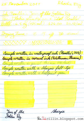
Happy New Year everyone! To continue where I left off last year, I'm going to do a quick review of another yellow highlighter ink, namely Noodler's Year of the Golden Pig. Why a quick review? Because this ink is incredibly similar in appearance to my previously tested highlighter ink, Noodler's Firefly Yellow, I will only mention the differences between the two. For appearance and general behavior such as drying time, bleedthrough, feathering, please refer to my review of Noodler's Firefly. I tested both inks in my trusty Pilot Parallel 6.0mm which works really well in the role of highlighter marker.

I already said that there's virtually no difference between these two inks, at least as far as I can see. If I squint and concentrate really hard, I do believe that Year of the Golden Pig is slightly more intense. I suspect that this is due to the second of the differences listed below (opacity).

Bottle
Noodler's Year of the Golden Pig is more expensive than Firefly and it only comes in the large 4.5oz (133ml) bottles which cost $24 or $0.18 per milliliter.

Opacity
While Noodler's Firefly is clear, Year of the Golden Pig appears milky. As a result, the latter behaves more like a pigment-based ink while Firefly feels dye-based. I'm not sure if that's actually the case but this is how these two inks feel to me.

As a result of this milkiness, Year of the Golden Pig has the potentially annoying habit to dry up in a thick crust inside the pen you are using. Such was the case with my Pilot Parallel. I haven't managed to completely clean up the muck after washing it throughly with water. I will keep trying. If you are using this ink in a proper felt-tip highlighter marker, obviously this won't be a problem, and this cautionary tale is valid only if you use something like the Pilot Parallel.

Water resistance
Although I haven't tested the two inks fir water resistance (because I deviated from my standard way of testing inks), the biggest distinction between them, and perhaps the only one that should matter to anyone, is that Year of the Golden Pig is waterproof, while Firefly is not. If you need a waterproof highlighter marker, then I believe you don't have another choice.

Flow
It seems to me that Firefly flows a little better than Golden Pig. This fact plus the water resistance might give credence to my pigment theory.

Conclusion
If one had to make a choice between these two inks, it wouldn't be too hard. The biggest question is whether you need water resistance or not. If not, then it's Noodler's Firefly all the way. Not only is this ink less fussy (it cleans easier and flows better) but it can be bought in a smaller bottle and is less expensive. You can also use it in either a marker or something like the Pilot Parallel without fear.

On the other hand, if water resistance is high on your list of priorities, Noodler's Year of the Golden Pig is the obvious choice, provided you only use it in a marker, or a dedicated Pilot Parallel. Also, in a fountain pen, daily use is indicated, otherwise the ink stagnates and might clog up the pen eventually.

There is one other yellow highlighter ink that I would like to test but I could kick myself for not buying a sample when I had the chance. It simply slipped my mind. That ink is Pelikan's M205 Duo. I am curious to put these three inks next to each other but it won't happen very soon I'm afraid. Until then, you can still chose between these two Noodler's inks which, combined, should serve most needs.

Here's a sample of Noodler's Year of the Golden Pig tested on Rhodia 80g paper, also compared with a classic Sharpie marker. The photo doesn't do full justice to this ink, believe me. The ink is much more vibrant and eye-searing in real life. Notice that the Sharpie looks a little bit dull in comparison.
Noodler's Year of the Golden Pig

Jinhao X750 fountain pen review

$
0
0
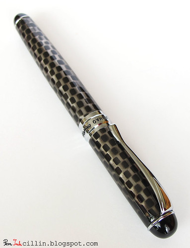
A long time ago, back in November of 2011, I posted a very short snippet about a new fountain pen that I acquired. Since these types of pens are not very mainstream (to my knowledge), I turned this into a game by masking the photo and asking my readers if they can identify it. It didn't take long for the pen to be identified. I guess I did a poor job at obfuscating it. Anyway, that pen, and the subject of today's review, is a Chinese Jinhao X750 with a broad nib.

Jinhao X750

It took me this long to review the pen because I've been using it for several weeks with multiple inks.

This was an unplanned purchase but while I was browsing the web a few months ago I came upon these Chinese pens and noticed that brands like Jinhao and Hero have a huge variety of designs. After much research I settled upon a Jinhao. The X750 model seemed decent enough and it was one of the few that offered a broad nib. I picked a checkerboard pattern design.

Jinhao X750

These pens can be bought for very little from eBay. I bought mine for about $8, shipped. I didn't have much faith that it would write incredibly well but I thought it was worth a shot for the price. I also decided that I would take it to work and use it on a daily basis, something that I am hesitant to do with my more "expensive" pens, or at least those that cost more than $20.

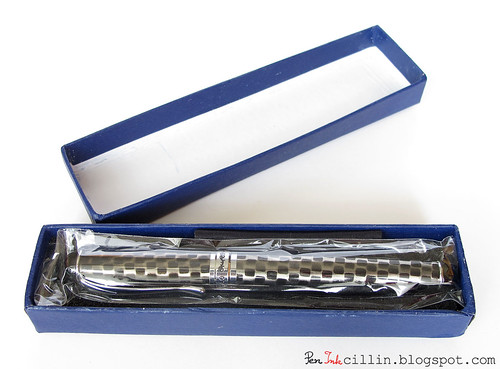
The X750 comes in a blue cardboard box but you might as well throw it away because it's rather cheap-looking.

Jinhao X750 box

Jinhao X750 open box

Body and materials

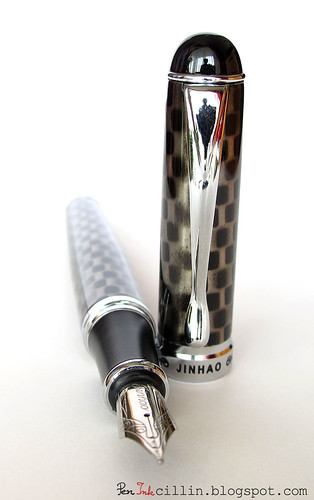
The Jinhao X750 is the first pen I laid hands on that's made entirely out of brass. The pen itself has a very solid construction and it feels weighty and ponderous in your hand. There are many imperfections in the checkerboard pattern: some of the squares seem faded, others overlap awkwardly, some of them are smudged and so on. Still, the pattern is ingrained in the metal of the body and cap and I don't envision it coming off any time soon. It is definitely not painted on. It could be anodized but I'm no expert.

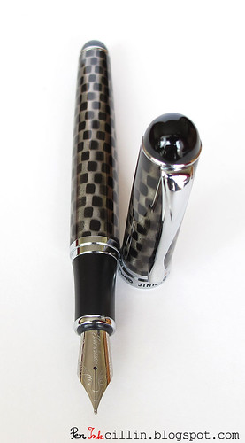
The X750 has a torpedo shape and both ends are rounded. At each end there's a black plastic finial with a thin piece of silver trim underneath.

Jinhao X750 uncapped


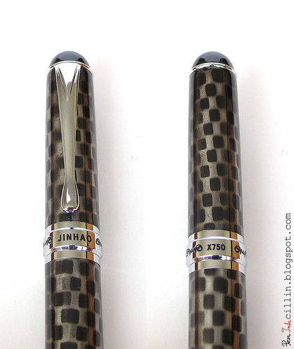
The cap features a thick band of silver trim which is real metal and is embossed with "Jinhao" on one side and "X750" on another, with a tribal-like design in between. A little bit gaudy if you ask me but overall the pen is not too kitschy.

Jinhao X750 cap trim

One of the things I don't like about the cap is the clip. While decent enough in form and shape, it is extremely stiff. Slipping it over anything is an exercise in strength. In fact I wouldn't even recommend clipping this pen to something sensitive, like a shirt pocket, because you'll end up ripping it to pieces.

Removing the cap and moving to the inside, the first large piece of plastic is finally revealed. I'm referring to the section, which seems to be made from some type of tough plastic but the thread which connects it to the barrel is, once again, brass.

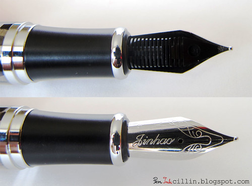
One of the first things you'll notice once you take the cap off is the nib. This is one humongous nib. It is easily the biggest nib in my collection and the only ones that match it are probably the nibs from a Pelikan M1000 or other such high-end fountain pen. I will talk more about the nib and feed further into the review.

Dimensions and weight

As mentioned, the Jinhao X750 is on the large side, both in dimensions and weight. I decided to compare it to my TWSBI Diamond 530 which used to be my largest pen, and the sizes are very similar. Capped, they are almost identical in length.

Jinhao X750 vs TWSBI 530 capped

Uncapped, the TWSBI is longer but the Jinhao has the larger nib. For the uncapped comparison I aligned the two pens by the end of the section, where the nib starts.

Jinhao X750 vs TWSBI 530 uncapped

Here are some hard numbers for you.

Length capped: 142mm / 5.6in
Length uncapped and un-posted: 127mm / 5in
Length of cap: 62mm / 2.4in
Length of nib: 23mm / 0.9in
Length with cap posted: 162mm / 6.4in

As for weight, this is the heaviest fountain pen I have used. It but it comes close to being uncomfortably so. The balance is good as long as you don't post the cap but if you do, most of the weight will be shifted to the top which makes it very awkward to hold. As a whole, I much rather prefer the TWSBI's weight.

Jinhao X750 uncapped

Speaking of the cap, it is a snap-on type and it closes with a very firm CLICK. I much prefer the Pilot Prera's snapping action which is incredibly smooth and cushioned but the Jinhao's snap is very definite and gives you plenty of confidence that the cap will stay put. Indeed, the cap closes very securely and it doesn't wobble in any direction.

Filling mechanism

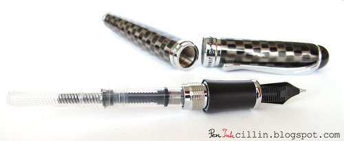
The Jinhao X750 has a dual-filling system in the sense that it comes with a piston converter which can be replaced with an international cartridge. The converter is fairly cheap looking and it didn't work great for me so I switched to a cartridge. I tried several inks with the X750 and the cartridge handled well. I am of a mind  to give the converter a second chance because the inks I used didn't flow very well, so perhaps an ink which flows more easily will work better in it.

Jinhao X750 converter

One last thing about the converter. There's a small spring inside the converter, between the piston gasket and the opening. I don't know what role it serves, except perhaps to prevent surface tensioning in the ink. I just wish it wasn't there because it has a nasty habit of trapping drops of ink.

Nib and feed

The Jinhao X750's nib is the biggest I've used. I chose the broad version even though Asian broad nibs aren't very common.

Jinhao X750 nib close-up

Here's a random comparison between a Pilot Prera nib and the Jinhao X750 nib. You can see just how enormous the latter is, compared to the much more delicate Japanese nib. On the other hand, the feeds are about the same size.

Jinhao X750 vs Pilot Prera nibs

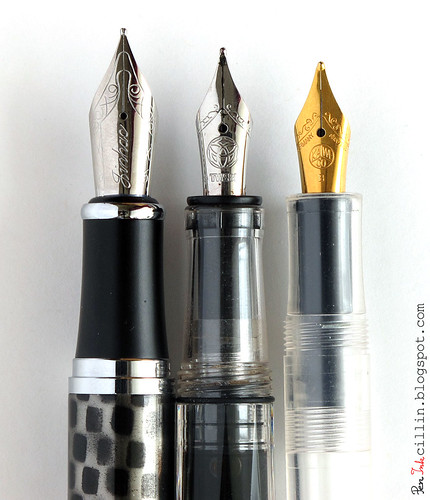
Here's another comparison between my 3 broad nibs: Jinhao X750, TWSBI Diamond 530 and Kaweco Classic Sport. You can notice immediately how big the Jinhao nib is, compared to the other two.
Jinhao X750 vs TWSBI 530 vs Kaweco Sport

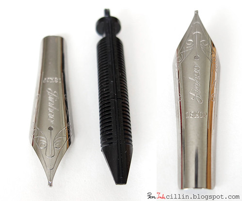
The nib is nice looking, with a floral design and the words "Jinhao" and "18kgp" embossed. The "18kgp" I assume means "18 karat gold plated" which, in my opinion, is ridiculous. This is a regular, rhodium-plated nib, there's no gold in it whatsoever.

The feed is plastic with many fins. It looks well made.

Jinhao X750 nib/feed

Both nib and feed easily slide in and out of the section, with little effort required. This makes it very easy to clean the pen.

Writing experience

So how does this pen stand up to some real-life use? Not very well I'm afraid. For one thing, flow wasn't great from the start. I flushed it well with ammonia solution and that seemed to make a small improvement. Still, I used about 4-5 different inks in this pen and none of them flowed well. The one which did best was Waterman Havana Brown which is also one of my favorite inks. On the other hand, this particular ink likes to flow really well so it's understandable that it performed well in the Jinhao.

Maybe it's the broad nib or this particular nib or poor quality control in general (though I suspect it's the latter) but I constantly struggled with this pen. It would dry up from one day to the next so I had to "exercise" it every time I picked it up in the morning. It would also dry up slightly between uses which made it skip for the first few words.

After a couple of words it would let up but it still had problems with certain letters, most notably the downstroke on lowercase letter "l" (for Larry).

In its defense, I did use a bunch of waterproof Noodler's inks (to be reviewed soon) which were kind of slow flowing and quick drying but I also tried Noodler's Navajo Turquoise a few days ago and the pen would barely write.

In the Jinhao's defense, it did write better on smooth, good quality paper such as Rhodia or Clairefontaine but that's not a big excuse because I really enjoy a fountain pen which writes well on any type of paper.

The other thing that I didn't really enjoy about the Jinhao X750 is the weight of it. That brass is heavy! Though the pen feels very solid, my fingers and hand start to tire after using it a while. It is simply too heavy for long sessions of comfortable writing.

In the end I just gave up on this pen.

Wrap-up

As you can see, the Jinhao X750 has some great potential but it is let down by poor quality control and the cumbersome weight of its body. I have no doubt that, were you to buy one, you would have different luck than me. I'm also tempted to try a medium or fine nib but I'm not sure I want to sink more money in these pens, no matter how cheap they are. For $8 shipped, the Jinhao X750 was not a bad experiment. It just didn't work out for me. There are plenty of people who've had good experiences with Jinhao fountain pens. If you are one of them, please drop me a line.

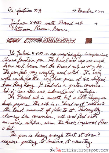
Here's a writing sample on Clairefontaine 90g paper, in Waterman Havana Brown ink.

Jinhao X750 sample

Noodler's #41 Brown ink review

$
0
0
Noodler's #41 Brown is the first brown ink I wanted to buy a long time ago, but because it wasn't in stock at the time, I ended up with Polar Brown. It turns out that these two inks are so similar that they could be identical twins which only their mother can tell apart.

The main features of #41 are that it is a rich, dense brown and it is also bulletproof, which includes resistance to water and substances that forgers might use.

Because this ink and Polar Brown are almost identical in aspect, I won't go into a lot of detail but I will mention the small differences I've noticed.

I only bought a sample of #41 and I tested it in my Jinhao X750 with a broad nib.

Bottle
#41 Brown comes only in Noodler's 3oz (90ml) bottles which cost $12.50 or $0.14 per milliliter. That makes it very affordable.

Color and saturation
#41 Brown is a rich, dark, as well as saturated, brown. If the nib is very thin or if the ink pools a little, you could mistake it for black. Compared to Polar Brown I believe I detect a little bit of neutrality. Polar Brown seems warmer in tone, when analyzing the q-tip color swabs.

Shading
There is very little shading and it becomes apparent only when using a thick swab or a broad nib. Because the ink is so dark don't expect the shading to show itself very often.

Feathering
I didn't notice any feathering, either on Rhodia or cheap paper.

Bleedthrough
Same as with Polar Brown, #41 doesn't normally bleed through paper but if you lay it thick enough, the red component of the ink starts to show through.

Flow and lubrication
One thing that I didn't like about this ink is that it felt dry in the Jinhao. I don't want to generalize and say that many of Noodler's bulletproof inks behave similarly but this is how I feel. Often I had to coax the ink until it started to flow well, but then again, it might be the Jinhao's fault.

Drying time
Drying time was very good on photocopier paper which is more absorbent, but less so on Rhodia where it took between 15 and 20 seconds for the ink to dry safely. From my experience, inks that dry quickly sometimes also bleed through the paper a little, so it's a trade-off you have to consider.

Smearing when dry
The thing that bugs me most about Noodler's Polar Brown is that, if you touch it with your finger or hand, it smears, even after it has had time to dry up. Come back a few weeks, or even months later after you've written something, rub it hard with your finger and the ink will get smudged. That isn't something I like, not when using this ink in a personal journal with 90g Clairefontaine paper.

The better quality the paper, the higher the smearing problem becomes, unfortunately.

I'm afraid that #41 Brown also smears. The good news is that it does it to a lesser extent. On regular, photocopy paper I had to rub it very hard indeed to see a little amount of smearing, while on Rhodia it performed slightly better than Polar Brown.

Smearing can be attenuated or even eliminated if you decide to dilute the ink a bit in water, at the loss of some saturation and darkness.

Water resistance
Since this ink is classified as "bulletproof" there are no surprises here. It is completely impervious to water. My water resistance test is done by holding the sample for a set time (>1 minute in this case) under running water. You will notice that... there isn't anything to notice. You can't even tell that the paper was submerged.

Conclusion
Noodler's #41 Brown is another solid ink from Noodler's, incredibly similar to Polar Brown. The differences between the two are very subtle but essentially they amount to Polar Brown being resistant to cold (useful for keeping a fountain pen in your car in winter) and #41 being slightly less prone to smearing. If you don't need cold resistance you could go for #41. Because it is dark and somber, this ink can definitely be used in a business setting. Also because it is so dark, it can be diluted to a big extent with water, greatly increasing its capacity in the process. Noodler's #41 Brown is not perfect but it is probably one of the best dark brown inks you will find.

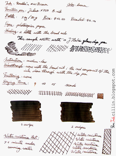
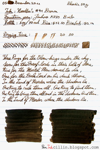
Here are the two samples I wrote with my Jinhao X750 (broad nib) on photocopier and Rhodia paper, respectively.

Noodler's #41 Brown

Noodler's #41 Brown on Rhodia

Stormtrooper defeated by Jinhao X750

$
0
0
And now for something different...

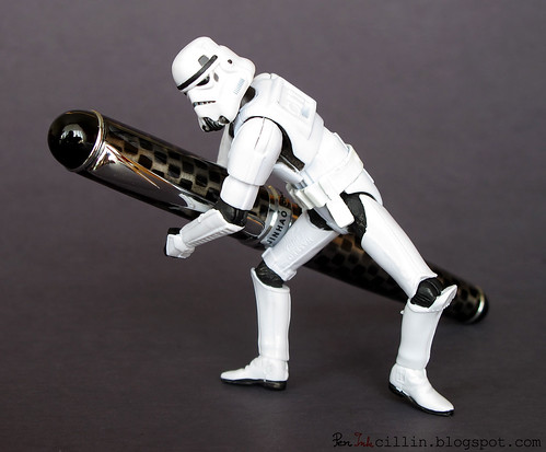
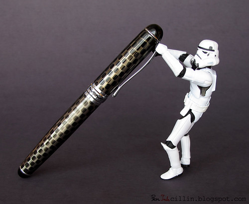
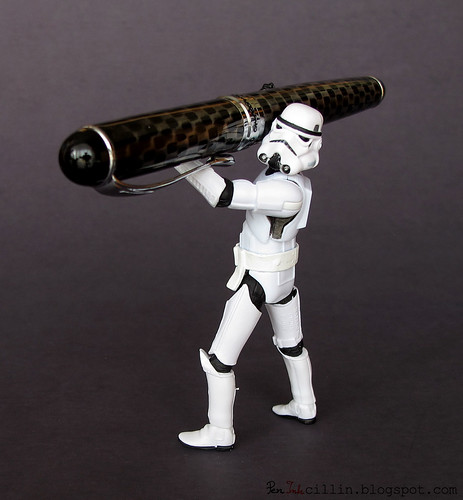
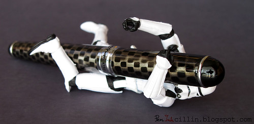
A while back I got one of these little plastic Star Wars stormtroopers, because I always wanted one, and I'm a big Star Wars fan (the original series, not the new garbage Lucas puked out more recently). Because these little guys are very posable, I decided to play around a bit with the stormtrooper and the Jinhao X750 fountain pen, which looks like some sort of torpedo from the future.

Here's what actually happened...

TK-421 knew he was on the fast track for promotion when Lord Vader personally assigned him to the task of unloading the new X750 experimental weapon (codename "Jinhao") from Vader's personal shuttlecraft. He was already imagining himself in the soft, crisp, officer's uniform. It was about time. He'd had enough of this blasted tin-can armor. But first thing's first...

TK-421 and Jinhao X750 #1

"Damn, this thing's heavy," he thought as he picked one end of the "Jinhao" off the sterile floor of the shuttle's hold.

TK-421 and Jinhao X750 #2

"Whew, at least I got the heavy end off the ground," he panted as he gathered his strength for the final effort.

TK-421 and Jinhao X750 #3

"There, momma didn't raise no quitter," he grinned, just before...

TK-421 and Jinhao X750 #4

"Dammit all to hell!" was his last thought before the blackness took him.


The "Jinhao" super weapon didn't kill poor TK-421 that day, but three months later Han Solo did.

THE END

Cheap nib flossing tool

$
0
0
What's a nib flossing tool? It's something thin enough that it can slip between the tines of a nib. And why would you want to do that? For two main reasons: to clean paper fibers stuck between the tines (which can affect the quality of writing) and to widen the distance between the tines (to increase ink flow).

I know that most of us who are not nib meisters are reluctant to fiddle with our nibs. Still, sometimes it's worth attempting a quick fix and very often a little flossing can cure a stubborn nib.

In the past I have suggested using a piece of 35mm film, which is usually thin enough that it fits in the tight space between a nib's tines. But who has 35mm film these days? Recently I have discovered a very simple tool that anyone can procure and it won't cost you a cent.

The thing I'm talking about is one of those electronic tags that are very often attached to merchandise such as clothes and electronics, to prevent them from being stolen. Here's how it looks.


If you peel the back, you will see the innards.


Peeling the transparent layer will yield you 2 metal shims that are on the thin side but will do a great job flossing any nib, no matter how tight the tines are.


Here it is in action, with the nib from my Noodler's Ahab.


So next time you buy something that has a tag attached, don't throw it away. Instead, salvage these shims because they might come in handy later.

Noodler's Kung Te-Cheng ink review

$
0
0
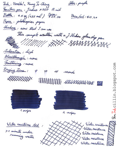
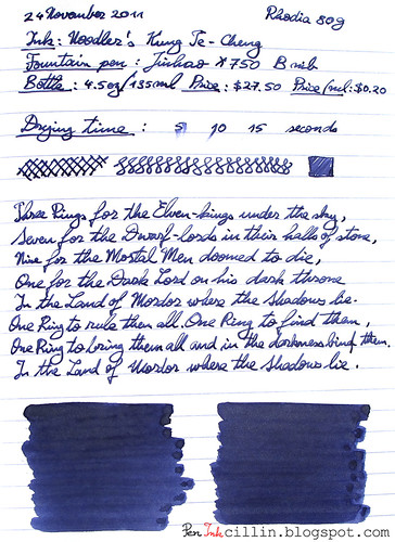
Noodler's Kung Te-Cheng is a very interesting ink. It is apparently reproduced from an ancient Chinese formula and it is meant to mimic the color of the inks used by Chinese emperors. If you ask me, I tend to agree that this color seems particularly royal. The ink itself is purple but it can trick you into thinking it is blue. It's in fact a purple-blue combination and, depending on how the light shines on it and the paper used, you could swear it's one or the other. I will classify it as purple because that is how it is designated.

Kung Te-Cheng is bulletproof which means it is resistant to a forger's chemicals and, more importantly, to water.

I tested Kung Te-Cheng in my Jinhao X750 with a broad nib.

Bottle
This ink only comes in 4.5oz (133ml) bottles, and it is rather pricy compared to other Noodler's inks. One bottle costs about $27.50 (or $0.20 per milliliter). On the other hand you do get some extra goodies with it, namely an eyedropper Platinum Preppy with an interchangeable ballpoint tip and also a brush pen.

Noodler's recommends that you use Kung Te-Cheng only with the provided pens and for good reason. You will see further on why.
Color and saturation
Kung Te-Cheng, as mentioned, is a mysterious blue-purple which seems to change its color depending on how you view it. Paper makes a difference and so does the light which shines on it. To me, it looks more purple on Rhodia than on photocopy paper. That's probably due to the fact that Rhodia absorbs less of it than photocopy paper.

Saturation is average to high. This is not a bright ink by all means but it is dark and opaque and it does stand out.

Shading
Noodler's Kung Te-Cheng doesn't show any shading to speak of, at least not when used with the broad nib of the Jinhao pen. With the q-tip it gets darker in places where the ink has the chance to pool up but I can't exactly call that shading.

Feathering
Kung Te-Cheng behaves very well in this respect. I haven't noticed any feathering, even on the cheap photocopier paper.

Bleedthrough
Surprisingly, bleedthrough is well contained, though if you press hard enough on the nib it will show through on cheap paper.

Flow and lubrication
Here's where some of Kung Te-Cheng's deficiencies start to show. I found that this ink is very dry flowing, especially in the Jinhao which is not exactly a champion of good flow. While I love the ink's other properties (color and water resistance), the fact that it felt as dry as sandpaper when writing with it helped to tone down some of my enthusiasm.

In addition I found that it tended to dry up in the pen and it also produced a fair amount of nib creep.

Drying time
Considering the above, it's not a big surprise that Noodler's Kung Te-Cheng dries quickly on Rhodia paper and even quicker on photocopy, within 10-15 seconds.

Smearing when dry
I haven't noticed any smearing but that's also helped by the fact that the ink is absorbed really well into the paper.

Water resistance
Needless to say, Noodler's Kung Te-Cheng is very resistant to water, in addition to other chemicals. After more than 1 minute under running water it remains rock-solid.

Conclusion
Noodler's Kung Te-Cheng is one of those classy inks that are quite beautiful to behold but still manage to be flawed. It can certainly be used in a business setting but in any case I would recommend a fountain pen which is very wet flowing, to compensate for its dryness. If strong chemical smell bothers you a lot you might also give Kung Te-Cheng a pass. While the chemical smell it emits is not overpowering, it is certainly there and it becomes evident when you start laying it down on paper. Water resistance is very often a good thing and in this aspect Kung Te-Cheng is a winner but this is offset by its tendency to dry inside pens and potentially ruin them in the very long run if you forget to clean them. I won't be buying a bottle of this ink but it is definitely worth to try at least a sample. I'm pretty sure that for art it shines, especially when used with a brush pen. Noodler's Kung Te-Cheng does a good job of capturing the mystery and nostalgia of Imperial China.

Following are the two samples I wrote on photocopy paper and Rhodia 80g, respectively.


Noodlers Kung Te-Cheng on photocopy

Noodlers Kung Te-Cheng on Rhodia

Noodler's Polar Green ink review

$
0
0
Noodler's Polar Green marks the third ink in Noodler's "Polar" range that I tested, the other two being Polar Brown and Polar Blue. Third time's the charm they say but not in this case, I'm afraid. Due to a combination of factors I just couldn't enjoy this ink.

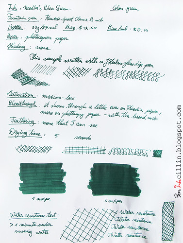
I tested Polar Green first in my Jinhao X750 and then, after being dissatisfied with the flow, in my Kaweco Classic Sport. Both pens have a broad nib.

As a reminder, Noodler's Polar inks are meant to resist very low temperatures, which make them ideal if you are a polar explorer. There is another, very practical, use for these inks though. Because I live in Illinois, which can get very cold in winter, I keep a Pilot Varsity filled with Noodler's Polar Brown in my car. Ballpoint pens always freeze in the cold and so would a normal ink. A Polar ink, on the other hand, feels right at home in the cold.

Another characteristic of the Polar range of inks is that they are bulletproof, which means water resistance as well as resistance to various chemicals that forgers might use.

Bottle
Polar Green comes in a 3oz / 89ml bottle and is priced at $12.50, or $0.14 per milliliter. This price is in line with most Noodler's inks.

Color and saturation
I was expecting an interesting shade but instead I got a very dull and melancholy green which is also fairly unsaturated. The color is definitely on the cool side of the spectrum. Essentially there's nothing cheerful about the appearance of this ink. You might like it but I don't. Polar Blue also had a subdued appearance but I enjoyed that ink a lot more.

Shading
Polar Green doesn't have any shading, unless you stack several layers of it.

Feathering
I haven't noticed any feathering, either on Rhodia or the cheap photocopier paper.

Bleedthrough
Unfortunately Noodler's Polar Green loves to bleed through cheaper paper. On higher quality paper such as Rhodia 80g or Clairefontaine 90g it shows some serious ghosting. This could also be as a result of using a broad nib but at any rate, it does show through. I could still use the reverse side of the cheap paper but while that may be ok for notes, it would probably look bad on official documents.

Flow and lubrication
Another place where Noodler's Polar Green fails to score any points is flow. This was one of the driest inks I've tested. It flowed poorly in the Jinhao X750 and only slightly better in the Kaweco. I am willing to give it the benefit of the doubt because I did not test this ink at the temperatures it was meant for. Perhaps it works much better when the temperatures are very low but I was hoping it would perform well at room temperature.

Drying time
It may fail at other chapters but Noodler's Polar Green dries in record time. This is one of the fastest drying inks I have tried. As you can see from the samples, it is dry in less than 5 seconds, and that's using a broad nib. Very impressive. On the other hand I've noticed that inks which dry very quickly also tend to bleed though the paper, which is definitely the case here.

Smearing when dry
No surprises here. Not only does Polar Green dry quickly but it doesn't smear one bit when touched. That's in opposition to Polar Brown and very similar behavior to Polar Blue.

Water resistance
Being a bulletproof ink, Polar Green's water resistance is exemplary. From the sample, you can see that after being held for over a minute under running water there isn't the slightest indication (apart from the rumpling of the paper) that this ink has been subjected to water.

Conclusion
Noodler's Polar Green is a peculiar ink. Personally I didn't enjoy it but looks are subjective and others might find that the dullness and lack of saturation are appealing. Is it appropriate for business use? Possibly, depending whether your line of work allows for green inks, even if they are subdued. If the dryness doesn't scare you away, then you might still be partial to the quick drying time and the high water resistance. One thing is certain: if you are in desperate need of a freeze-resistant green ink, then Noodler's Polar Green is the one and only ink for you.

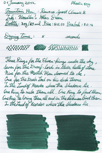
Following are two writing samples on photocopier paper and Rhodia 80g, respectively.

Noodler's Polar Green on photocopy

Noodler's Polar Green on Rhodia

Sailor HighAce Neo disassembled

$
0
0
Recently when I cleaned my Sailor HighAce Neo I found out by accident that it is very easy to take apart, which makes cleaning a lot easier than before.

Sailor HighAce Neo disassembled

I'm putting this out there for others who might not be aware of this fact. Please note that the converter is bought separately but even it can be taken apart in no less than 5 pieces, simply by unscrewing the metal sleeve at the end.

As for the pen itself, the nib and feed come out easily by pulling. They are friction fit and also keyed so that there's only one way in which they go into the section. My nib is stained and simple scrubbing with soap didn't clean it. I just don't care so I won't bother trying with more powerful substances.
I just love a fountain pen which is easy to disassemble!

Noodler's Baystate Blue ink review

$
0
0
Well then folks, here we are, finally, with the fabled and notorious Noodler's Baystate Blue ink. If you've been watching the fountain pen community for a while, you are probably aware how controversial this ink is (or at least was). I'm not going to repeat what the controversies are because I want to start this review with a clean slate.

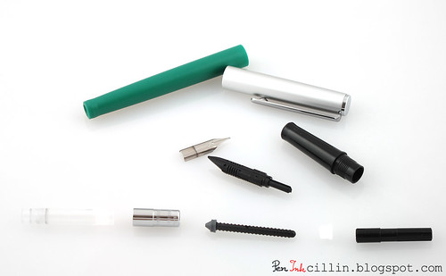
I wanted to try Baystate Blue for a while and I had a sample for months, just waiting for me to use it. I kept putting it off but finally decided to load it up in one of my Platinum Preppys, not the eyedropper from the review but a regular Preppy with a cartridge. I just filled up the empty cartridge with a syringe and off I went.

I kept an open mind during my time with this ink but I might as well just spill part of the beans here: even my low expectations were too high. Read on to find out why.

Bottle
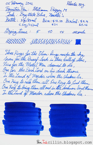
I only bought a sample but Baystate Blue comes in two bottles types. There's the classic Noodler's 3oz/89ml bottle for $12.50, or $0.14 per milliliter. And then there's the large eyedropper bottle at 4.5oz/133ml for $21 or $0.16 per milliliter. While the big bottle seems more expensive, it does come with 2 pens: a Platinum Preppy eyedropper with an additional rollerball tip and a brush pen.
Color and saturation
Baystate Blue's color and saturation are legendary. While they are both very bright, I think my expectations were a bit too high and I wasn't exactly blown over when I first started writing with this ink. It is a bright cobalt blue, very saturated, and yet I couldn't help but feel that this is just an ordinary blue ink.
In the writing sample on photocopy paper I also did a brief comparison with another bright ink I own, Noodler's Navajo Turquoise. While these two inks are different in every way, Navajo Turquoise is also a bright blue ink. To my mind, the brightness and saturation of the two inks are almost the same, with Baystate Blue being a little bit darker, and obviously of a different hue.

Shading
Baystate Blue doesn't exhibit any shading. It's a flat ink, although there are some shadows in the thick swab done with a q-tip. Still, I wouldn't call this a shading ink.

Feathering
I didn't notice any feathering but other reviewers have. Different batches of ink perhaps?

Bleedthrough
Once again, Baystate Blue was very well behaved. The q-tip shows some ghosting but that's to be expected from such a saturated ink. The Preppy didn't bleed one bit.

Flow and lubrication
Here's where Noodler's Baystate Blue starts to slide downhill. One of the things that annoyed me about this ink was the poor flow. The Preppy itself can't be the problem because I've tried it with other inks and it flows well, not too wet but just right. Baystate Blue didn't flow well at all. While it didn't exactly skip, it felt very dry and wasn't at all a pleasure to write with. After resting in the pen over the weekend, it would sometimes dry up and would require some vigorous shaking to get it started. I hate dry inks so this is strike one.

Drying time
The drying time was very good. Baystate Blue dried between 5 and 10 seconds on regular paper and slightly longer than that on Rhodia. Considering how dry this ink is, it wasn't surprising.

Smearing when dry
Baystate Blue doesn't smear at all when dry. I'm thankful for that at least.

Water resistance
Noodler's Baystate Blue is water resistant but not bulletproof. As a result, it doesn't wash off when exposed to water but some of the dye does come off, as you can see from the sample.

Conclusion
You might have noticed that my review doesn't seem to find too many negatives about Noodler's Baystate Blue. The only significant issue seems to be its dryness. To me, a dry ink is a big no-no. This, alone, would cut an ink off my list. However, there are other, more subtle things wrong with this ink. Perhaps because I was hoping for this ink to be eye-searing, I was a bit disappointed that it wasn't. Yes, it is bright and saturated but so are other inks. It is possible that this is the only blue ink with such properties. Still, I haven't tested enough blue inks to be certain. I have a suspicion that there are other bright blue inks out there which are more fun to use.

The other thing that I didn't mention yet is the difficulty of cleaning anything that comes in contact with Baystate Blue. I was wary of this ink from the start. I heard stories of what it can do and I treated it with caution. Yet, it permanently stained the insides of my Platinum Preppy and the cartridge I used, despite flushing it with water for almost half an hour. The sink was collateral damage, as well. I made sure to use my dark sink but even that didn't escape unscathed. The damage wasn't permanent though. It cleaned up with the usual bathroom cleaning supplies. Baystate Blue even managed to stain my yellow Ahab which happened to rest on a piece of paper towel imbibed with BSB. Luckily, it came off easily with rubbing alcohol.

Incidentally, if you need to clean Baystate Blue off of something, I recommend rubbing alcohol. It seems to work well, but you'll have to rub it hard. Unfortunately it isn't always possible to rub the insides of a pen. For that reason, if you really gotta have this ink, I recommend a dedicated fountain pen, preferably a cheap one. As long as you don't plan on cleaning that pen or using another ink in it, you should be fine.

So there you have it. My experience with Noodler's Baystate Blue has shown me that the controversy surrounding this ink does have some truth to it. It does stain whatever it comes in contact with and it felt dry and unpleasant to write with. It's a no-buy for me. Your mileage may vary.

Below you have two samples of Baystate Blue, on photopier paper and Rhodia 80g, respectively.

Noodler's Baystate Blue on photocopy

Noodler's Baystate Blue on Rhodia

Pilot Varsity and Noodler's HoD revisited

$
0
0
Today I'm going to talk to you about a fountain pen and an ink that I have already reviewed. The two were reviewed separately but now they've come together, and it is such a good match that I just had to say a few words about it.

As you might know, I'm not a fountain pen collector and I certainly don't own expensive pens. My most expensive fountain pen costs around $50. Yet, one of the best fountain pens I have in my humble collection, which also happens to be the cheapest, is the Pilot Varsity. While many users of the Varsity most likely don't give it a second thought and simply throw it away after the ink is depleted (because, after all, it is a disposable pen), I have chosen to refill my Varsities with all kinds of inks.

Pilot Varsity in 7 colors

Follow the link to my review if you haven't read it already, but I would like to re-iterate the fact that the Pilot Varsity has an amazing nib-and-feed system which offers very smooth writing, great flow and even defies drying (with the cap off), something which even very expensive fountain pens fail to accomplish. The post (linked above) which details the refilling process shows an anatomy of the Varsity.

Pilot Varsity

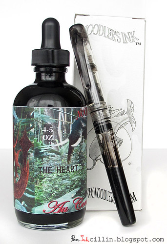
Next, we have Noodler's Heart of Darkness, a black ink with a heart, if you will forgive the silly pun. I like this ink for all kinds of reasons. I wanted the blackest ink possible and HoD fills the bill. Ironically, I've heard that Noodler's Black is even darker but I have yet to test that ink.

Noodler's Heart of Darkness and Platinum Preppy

Heart of Darkness has plenty of good features across the board. It is a very easy ink to work with and it is also very resistant to water. In fact it might be the best performing (and well behaved) waterproof ink I have tested.

Now, take these two ingredients and combine them into... drum roll... a Pilot Varsity filled with Noodler's Heart of Darkness. I have been using this for almost two weeks and I have to say it is amazing. It's simply (cheap) fountain pen heaven.

The Varsity gives good flow with any ink but HoD makes it even better. It flows wet, not extremely so but just the way I like it. On a 1-10 scale, it is at least a 7, if not 8.

The Varsity's nib is smooth but with Heart of Darkness it becomes a baby's butt. I don't know what's up with HoD but I suspect it has some very good lubrication.

Apart from these two features that stand out, all the best characteristics of the pen and ink are now combined into one.

This is all I wanted to say but I highly encourage you to experiment with your Pilot Varsity. If you also happen to have Noodler's Heart of Darkness at your disposal, even better. You might give up more expensive fountain pens entirely!

3 dollar nib flossing tool

$
0
0
Some time ago I showed you how to make a cheap nib flossing tool from a security tag found on many store-bought objects. But what if you want to go big? What if you want to invest some serious money into a serious tool?

Well, the good news is that you don't have to break the bank to do that. I guess the main disadvantage with the shim I was talking about in my previous post is that it only has one size. For certain situations it might be too thin. If you need something thicker that shim might not be for you.

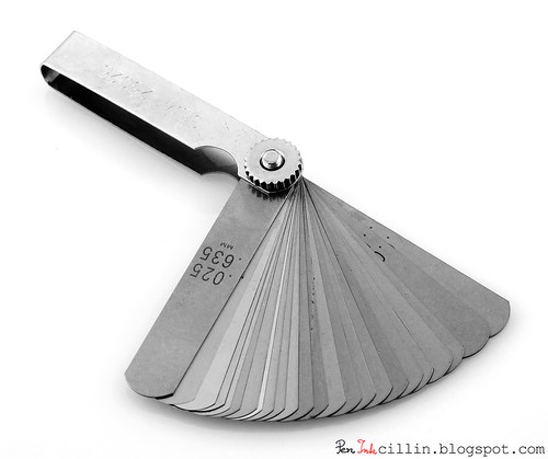
I can't take credit for this idea because I read it somewhere on the internet but it turns out that a really good nib flossing tool is one of those feeler gauges that are used to measure the distance between two objects that are extremely close. Typically it is used to set the distance between the electrodes in a car's spark plugs (though I understand modern spark plugs don't require this adjustment anymore). Here is mine:
Feeler gauge

This tool can be purchased in any auto-store. I paid about $3 for mine. It's all-metal and the quality feels very high.

The thickness of the shims varies between .0015-inch/.038mm and .025-inch/.635mm. The thinnest one feels thinner than paper. Seeing that not all nibs can be flossed in the same way, I would say that this tool is a very good investment. One word of caution though: mine was (and still is) covered by a thin film of lubricant. You might wanna rub it off before using it.

J Herbin glass dip pen review

$
0
0
I will admit that I cheated a bit with this review. I tagged it as "fountain pen review" when it should have been "dip pen review" but I figured I wouldn't be reviewing a lot of dip pens on this blog so I might as well bundle it with my regular fountain pen reviews.

This particular J Herbin glass dip pen is part of the largest pen and ink order I placed over a year ago. I haven't reviewed it until now because I've had more important things to review. It turns out that there isn't much to say about a dip pen, especially one as simple as this.

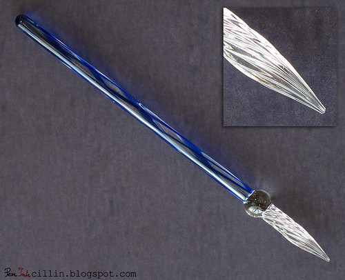
J Herbin glass dip pen

There were two J Herbin glass pens for sale when I bought mine. There's a more elaborate one (which looks more fragile) and then there's this one. I opted for the simpler (and cheaper) one because I was more interested in the functionality than the aesthetics.

At $15.75 this pen isn't exactly cheap (considering that actual fountain pens can be bought for this amount) but on the other hand these pens are supposed to be hand-crafted so I guess that's where the bulk of the cost is. The more intricate pens are more expensive, at $20+.

The J Herbin dip pen is crafted from a solid glass rod with a colored spiral pattern surrounding it. This rod is on the thin side, about as thick as your average pencil. I can't say that it makes for comfortable lengthy writing. The rod (or body of the pen) ends in a transparent glass ball which, I assume, is there to help you grip the pen and also to prevent ink from getting on your fingers. Moving on, we have the tip, which is also glass, twisted tightly to form a series of spiral grooves.

The grooves serve a simple purpose: they trap the ink between them so that you don't have to dip the pen after every word, essentially acting as a reservoir. Thanks to this simple design, you should be able to write a whole line or two before re-dipping.

The tip itself is quite broad, if you will forgive the use of the term. It is not very precise and if you look at it closely you'll see that it resembles a cone, meaning that it is uniform on all sides. This is, perhaps, one of the reasons why this pen doesn't write very well. The other reason is that the part of the tip which touches the paper isn't smooth. Instead, it is rough.

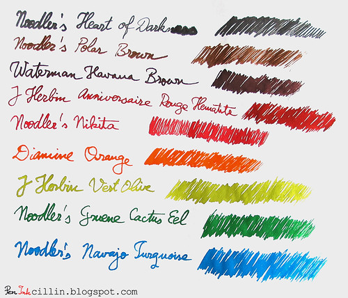
The pen does write, as you can see from the sample below. However, you need to be careful how much ink you "load" on the tip, or else you'll end up with it pooling on the paper, as is the case with the last 3 letters of the word "Darkness". The very nature of the dip pen causes text to be uneven: it starts out thick and saturated and it slowly thins out and fades away as the ink is depleted.

J Herbin glass dip pen sample

Thanks to the rough tip, the pen feels raspy on paper. Is this design intentional? If you have any information regarding this I'd be happy to hear about it. The roughness doesn't bother me a lot because I'm aware I'm not using a fountain pen with a metal nib.

J Herbin's glass dip pen feels a lot like a novelty pen to me. It is pretty but there are dip pens which cost much less and write a lot better. I have found a good use for this pen. Virtually all my ink reviews have a small sentence written with this pen. The writing itself is ugly (because the pen distorts my already-messy script) but the point is to show the ink's saturation and shading (if available). There's another advantage to a glass dip pen: it cleans incredibly easy. You can use any type of ink on it (even Baystate Blue!) and it will never remain stained. It's glass, after all, and glass is inert in contact with inks.

Would I recommend it? Not really. I find it too expensive for its limited utility. But don't let that stop you from buying it if you are so inclined!

The inks used in the sample are all the bottles I own (alas, only 9 of them) and I have reviewed all of them in the past:

Noodler's Heart of Darkness
Noodler's Polar Brown
Waterman Havana Brown
J Herbin 1670 Anniversaire
Noodler's Nikita
Diamine Orange
J Herbin Vert Olive
Noodler's Gruene Cactus Eel
Noodler's Navajo Turquoise

Noodler's Dragon's Napalm ink review

$
0
0
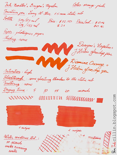
Noodler's Dragon's Napalm is an ink that I wanted to try for a long time. I finally decided to test the sample I've been saving. My general impressions are good. This is a very balanced ink but the color may be off-putting to some due to its brightness and saturation. Oh, in case you're wondering, this ink is classified as orange, but more on that later.

I decided to test Dragon's Napalm in my Lamy AL-Star and I fitted the 1.5mm italic nib for the occasion. I thought that a very broad nib would showcase the ink better than a regular nib.

Bottle
Noodler's Dragon's Napalm comes in 2 bottles. There's the classic 3oz/89ml bottle which sells for $12.50 or $0.14 per milliliter. And then there's the large 4.5oz/133ml bottle fitted with an eyedropper, which goes for $21, or $0.16 per milliliter. The latter, however, also includes a Noodler's eyedropper fountain pen. It's up to you if the bigger bottle is worth the price difference. The general wisdom remains that if you anticipate using gallons and gallons of this ink, you should probably go with the big bottle.

Color and saturation
Ah, here's where Dragon's Napalm comes into its own. The color of this ink is very peculiar. The best way to describe it is to tell you a little anecdote.

When I finished the samples for this review, I asked my wife how would she characterize this ink. She pondered for a second, then said "Well, it isn't orange and it isn't pink". There you have it, straight from the mouth of babes (forgive the pun). Dragon's Napalm is a strange mix of orange and pink. It is better characterized by what it is not, rather than by what it is.

Retailers classify it as orange and so do I. But you could just as well claim it's a pinkish orange as you could claim it's an orange-ish pink. Whatever the case, I would appreciate your opinion in the comments.

As for saturation, it is high. The ink pops out at you from the page and comes close to doing damage to your retinas (I kid, of course). In the sample that I did on photocopy paper you can also see a comparison with Diamine Orange (of which I own a bottle). That one is a true orange ink and the difference between the two inks is obvious from the swatches.

Shading
Just like its Diamine "rival", Dragon's Napalm is a flat color, without any shading present.

Feathering
None.

Bleedthrough
There is a little ghosting in evidence, thanks to the 1.5mm italic nib, but even this nib produces extremely little bleed on cheap photocopy paper, except in places where I pressed too hard on it. The q-tip swatches tend to bleed a little in places where the ink had the chance to pool. On the other hand, Rhodia 80g paper is much more resistant to ink and neither does it ghost, nor does it bleed.

Flow and lubrication
The flow is excellent in my Lamy AL-Star, despite the 1.5mm nib requiring more ink than a normal nib. The ink feels just a tiny little bit dry on paper but this could also come from the nib. It's hard to tell exactly because it is a subjective experience but it seems to me that Dragon's Napalm is not a 10/10 on the lubrication scale. Nevertheless, the very small resistance that it gives when writing is just right.

Drying time
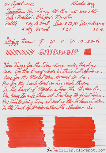
Noodler's Dragon's Napalm dried fairly quickly, around the 10-15 second mark, despite the 1.5mm nib, on both photocopy paper and Rhodia.

Smearing when dry
No smearing whatsoever.

Water resistance
Big fail here! But don't worry, this ink wasn't billed as a water resistant ink. As you can see from the sample, it washed off almost completely after 10 seconds under running water. Just don't dunk your masterpieces penned in Dragon's Napalm in liquids and you should be fine. What's interesting about these water resistance tests is that sometimes you get to see an underlying pigment or component of the ink. In the case of Dragon's Napalm, there are strong traces of yellow.

Conclusion
Noodler's Dragon's Napalm is a very bright and saturated orange-pink ink with some very solid and balanced properties. Everything about this ink reminds me strongly of Diamine Orange and even the color comes close, though you won't confound the two. I couldn't find anything to criticize about Dragon's Napalm. For that reason I highly recommend it, if you are looking for a bright orange ink (with a twist).

Noodler's Dragon's Napalm on photocopy

Noodler's Dragon's Napalm on Rhodia

Private Reserve Electric DC Blue ink review

$
0
0
This is my first time testing and reviewing a Private Reserve ink and so I feel a little bit like a pioneer exploring new lands. I bought a sample of this ink partially attracted by the name, Electric DC Blue, which hinted at a more unusual shade of blue. I will admit that the name is a bit misleading, but read on to find out why.

I had a hard time finding out where Private Reserve inks come from but apparently they are manufactured in the US, in Indiana. That's cool to know. I had no idea that there were other US manufacturers apart from Noodler's.

I tested Private Reserve Electric DC Blue in my trusty Pilot Varsity which I use every day at work.

Bottle
Private Reserve bottles have a capacity of 50ml / 1.7oz and this particular ink is $8.75 per bottle or $0.17 per milliliter. A very affordable price.

Color and saturation
Electric DC Blue hints at something more vibrant, perhaps even similar to Baystate Blue, but the ink is actually a somber navy blue, I would almost call it blue-black. It features fairly high saturation, but I see nothing "electric" about it, whatever that means.

Shading
Because Electric DC Blue is darkish, you will be forgiven to believe that it doesn't have any shading. In fact it does, but it's very subtle. The q-tip sample shows what I'm talking about. Under the correct light I can also detect a very faint red sheen, almost like Diamine Midnight Blue but make no mistake, you won't see this in normal use.

Feathering
There is no feathering that I could discern.

Bleedthrough
On Rhodia, as usual, Private Reserve Electric DC Blue does not bleed through at all. On a fresh sheet of photocopy paper it doesn't bleed either but there is some slight ghosting, perhaps in large part due to the darkness of the ink. I have noticed that this ink likes to be absorbed by paper so if you use poor quality paper then you will see some bleed. That is especially the case with paper that has been laser printed on one side. I use such scraps for random notes, at work, because I like to get as much use out of paper as possible. In this case, the paper is rendered more absorbent by the heating process of the laser printer and the ink tends to bleed liberally. I'm perfectly ok with that though. I generally like inks that permeate the paper.

Flow and lubrication
Electric DC Blue flows very well and was quite wet in the Pilot Varsity. It also felt well lubricated on paper, where it glided effortlessly. These are all features that I appreciate very much in an ink.

Drying time
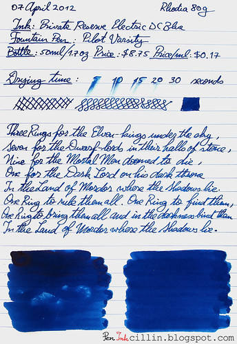
The drying time on cheap paper is quick, once again, due to the ink being absorbed rapidly. On Rhodia the situation seems reversed. It took over 30 seconds for the ink to dry completely and not smear. It looks like the more higher quality (and coated) the paper is, the longer it takes for DC Blue to dry. That's pretty much inline with most inks, so no surprise there.

Smearing when dry
None.

Water resistance
This is by no means a waterproof or even water resistant ink. I found it interesting that the ink isn't washed away immediately when exposed to flowing water. It took me a little over a minute of holding under a running faucet to cause it to run, and it did so gradually. If you dunk it in water and hold it there then you will lose whatever you had written, but if you get some water on it by accident you might still be able to save it by drying the paper right away. Just don't wipe the water off, or you might also remove the ink.

Conclusion
Electric DC Blue is my first foray into Private Reserve ink territory. It has been a pleasant experience, with a very well-behaving ink. The pen felt very smooth when writing and this is something that I hold very dear. I especially appreciate a greater-than-average wet ink because I like to see the sheen of wet ink on paper after I write. The one little flaw (if you can even call it that) of Private Reserve Electric DC Blue is that it prefers more expensive paper but this wasn't enough for me to dislike it. Overall, a solid performer.

Next, you can see the two samples on photocopy and Rhodia 80g paper, respectively.

Private Reserve Electric DC Blue on photocopy

Private Reserve Electric DC Blue on Rhodia

TWSBI Diamond 530 parts

$
0
0
For the first time since I've had my TWSBI Diamond 530, after a year of using it, I decided it was about time to take it apart to pieces and give it a thorough cleaning. I have used only two inks in it: Noodler's Polar Brown and Waterman Havana Brown. It is very indicated to clean your fountain pen when changing inks but I was too lazy to do that when I switched from Polar Brown to Havana Brown. Thus, Havana got mixed with the few drops of Polar that still remained in the pen.

The result was a darker Havana Brown but in no way was the quality of the writing compromised. The Diamond 530 wrote as well as before, with the broad nib. As a parenthesis, I haven't used the original EF nib for a long time. Once I fell in love with the B nib I saw no reason to fall back on the EF.

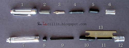
Here's my TWSBI Diamond 530 disassembled into its basic parts.

TWSBI Diamond 530 parts

I really like a fountain pen that can be broken apart as much as the TWSBI. It makes for easy and thorough cleaning, not to mention that you can learn more about the inner workings of the pen. I'm going to give a short description of each of the parts in this exploded view.

  1. Cap - it can be further disassembled by removing the inner screw that fastens the clip. I didn't have the correct tool for this so I skipped it.
  2. Inner cap - this little piece helps seal the nib inside the cap so that the ink doesn't dry. It is friction fit and can be tricky to remove, unless you know the trick. It's quite easy actually: take a pencil (preferably one with an eraser at the end), wrap an elastic band around the eraser, stick it inside the cap until you feel it squeezing tightly inside the inner cap, and the pull it out. It should drag the inner cap with it.
  3. Nib
  4. Feed
  5. Inner section - this piece holds the nib and feed together. It is keyed such that there's no chance of fitting the nib and feed in the wrong position. Notice that there's also a small o-ring there which I haven't removed.
  6. Outer section - it has 4 tiny grooves distributed equally on the inside. When you push the inner section inside it, make sure to match the grooves, otherwise this piece might crack over time. 3,4,5 and 6 form the nib unit.
  7. Barrel - it has another o-ring which seals the nib when the cap is screwed on. At the other end there's a metal inner collar with threads to which the piston mechanism is attached.
  8. Piston
  9. Piston rod
  10. Piston holding thingy - sorry, don't know what this part is called but it screws on to the end of the barrel, counterclockwise. The piston rod goes through it.
  11. Piston activation thingy - this bit actually operates the piston rod. It has a spiral thread inside which fits the spiral on the rod.
  12. Piston knob - This screws on to #10 and actuates #11.
  13. Wrench - this comes with the pen and is used to remove #10.

So this is what makes the TWSBI Diamond 530 (and also the 540) tick. I apologize if I haven't named the parts correctly but I have no idea what the technical terms for some of them are. Now the tricky part will be to put it back up together!

Waterman Purple ink review

$
0
0
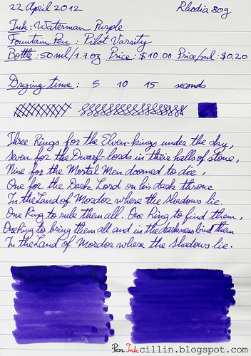
For my second Waterman ink, after Waterman Havana Brown, I tested their Purple ink, which is now called Tender Purple. Tender, perhaps, because that's the shade of a particularly nasty bruise? Maybe. I bought a sample of this ink and tested it for two weeks (that's about how long a typical 2ml sample lasts me) in my trusty Pilot Varsity. To be honest, I was expecting more of this ink. I am slightly disappointed for some of the reasons detailed below.

Bottle
Waterman bottles hold 50ml (1.7oz) and cost $10 or $0.20 per milliliter. Well, it seems that along with the re-branding, Waterman also increased the price of their inks from what used to be $0.17 / ml. Either that or retailers are selling it for more.

Color and saturation
Waterman Purple's color can be best described as "pansy". It's not very saturated and depending on the paper, it can even look dull sometimes. It just doesn't have the punch I was expecting. On copy paper it tends to look better because more of it gets absorbed into the paper but not so much on Rhodia.

Shading
To tell the truth, I was hoping for some excellent shading like Havana has. Unfortunately, Waterman Purple seems to belong to a different family because there isn't much shading to speak of. There is some, but it's very faint, influenced perhaps by the blandness of the ink. From the samples you can see that the q-tip swabs do show some nice shading but unfortunately we don't normally write with q-tips. In a normal fountain pen I'm afraid you won't see much of that shading.

Feathering
None that I could discern.

Bleedthrough
There isn't much bleedthrough and certainly not on more expensive paper like the Rhodia 80g. On copy paper there's some slight ghosting depending on how hard you press with the nib.

Flow and lubrication
Waterman Purple felt a little bit dry. Not much, but it just didn't glide across the paper like Havana.

Drying time
Drying times were very good. On Rhodia it took 10-15 seconds to dry but on photocopy paper the ink was smudge-free in 5-10 seconds. That's not unexpected considering the average saturation and slight dryness.

Smearing when dry
None.

Water resistance
This is not a water resistant ink. Holding the sample for a minute under running water washed most of the ink off.

Conclusion
I was expecting more of Waterman Purple. I hoped for some interesting shading and more saturation. I also hoped for better flow. Unfortunately this ink left me unsatisfied. I am sure there are better purple inks out there and if you like a more vibrant color I can always recommend Noodler's North African Violet which is really beautiful but has the disadvantage of being tough to clean, not to mention that it can stain a pen real bad. I will keep looking for the perfect purple ink but in the meantime have a look at the two samples, on copy and Rhodia 80g paper, respectively.

Waterman Purple photocopy

Waterman Purple Rhodia 80g

Pelikan Brilliant Green ink review

$
0
0
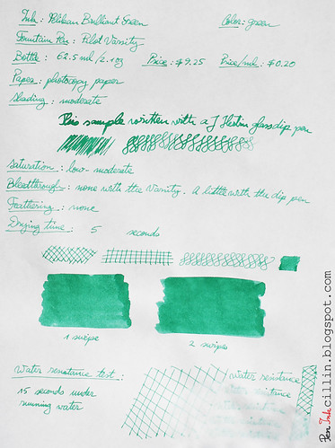
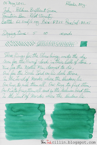
Welcome to my first review of a Pelikan ink! Although I didn't know what to expect from Pelikan Brilliant Green, the experience was so-so, leaning on the positive side. I only bought a sample which I tested in my trusted Pilot Varsity for over 2 weeks of daily writing.

Bottle
Brilliant Green comes in a 62.5ml / 2.1oz bottle which costs $9.25. At $0.20 per milliliter it isn't the cheapest ink, nor is it the most expensive.

Color and saturation
Pelikan Brilliant Green is, you guessed it, a green ink. Though it is the brightest green ink I have tested, I'm not sure I would call it "brilliant". The term "brilliant" implies something shiny, sparkly and perhaps even eye-popping. This, Brilliant Green is not. The color is, in fact, on the dull side and a bit washed out too. While the sample done with the q-tip looks brighter, that's by virtue of the large quantity of ink deposited on the paper. With a fountain pen, things are a bit different. I suspect this has something to do with the flow of this ink, discussed further below.

Overall I would liken this color to a light shade of emerald.

The watery nature of this ink doesn't help the saturation which is somewhere between low and medium.

Shading
Pelikan Brilliant Green may fail to sear your retinas but it features some surprising shading. This is especially evident in the large q-tip swaths but it is also apparent when writing with a medium nib like the the Varsity. The shading, in fact, reminds me strongly of watercolor. I did mention this ink is watery, didn't I?

Feathering
None.

Bleedthrough
The ink doesn't bleed through Rhodia paper, evidently. However, although I wrote in my review on copy paper that it doesn't bleed, upon using it some more I found that it bleeds a little on cheap paper, especially paper that's been abused a little (writing on both sides). I wouldn't worry too much about this unless you plan to use really cheap paper.

Flow and lubrication
I am puzzled by Pelikan Brilliant Green's flow. Though it glides relatively well across the paper (ok, feels a tiny little bit dry), the flow seems inconsistent. Can it be the Pilot Varsity pen? I'm doubtful because this pen has excellent flow with most of the inks I have tested. However, the more watery ones, such as J Herbin Diabolo Menthe, tend to flow poorly. I believe this is also the case with Pelikan's ink. The inconsistent flow practically means that one moment it writes wet, and if I pick it up again in 5 minutes it writes dry. All I can say is that this ink would get a huge usability boost if it wrote consistently and wetter.

Drying time
As you can see from the samples, drying times are very short, even on the shiny Rhodia paper.

Smearing when dry
None.

Water resistance
This isn't a water resistant ink. 15 seconds under running water almost wiped the ink clean from the paper.

Conclusion
Pelikan Brilliant Green is an ink with an interesting shade of green but the fact that it is watery doesn't help it stand out. Though the color is subdued you won't be able to use it in a formal setting. On the other hand, it can probably do a good job as watercolor substitute thanks to its strong - and quite lovely - shading. My sample had inconsistent flow issues and that's something to consider. You'll probably be fine using it in a pen with wet flow. Would I buy a bottle of Pelikan Brilliant Green? Frankly, no. While this isn't by far the worst green I've tested, it is a bit pricy for all its little disadvantages. In the meantime, I'm still searching for the perfect green ink.

Here are the two writing samples on photocopy and Rhodia 80g, respectively.

Pelikan Brilliant Green on copy

Pelikan Brilliant Green on Rhodia

Noodler's Bad Blue Heron ink review

$
0
0
Bad Blue Heron is yet another Noodler's ink with a quirky name. This particular ink belongs to the Warden series, which features extremely high resistance to forgery techniques and substances. This is always good to have, as a feature, because there aren't very many ink manufacturers who make waterproof inks.

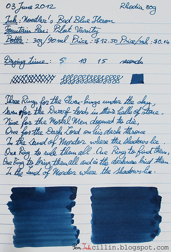
In what has become somewhat of a tradition for me these days, I tested a sample of Noodler's Bad Blue Heron (which lasts me about 2-3 weeks) in my trusty Pilot Varsity.

I'm still searching for the perfect ink so let's find out together if this is the one. I really didn't know what to expect before I used this ink but I was pleasantly surprised. What took me aback was a compliment I received on the ink's color from someone who doesn't know a thing about fountain pens and inks. That's a good start isn't it? But on with the review.

Bottle
Bad Blue Heron comes in Noodler's classic plain bottles of 3oz/89ml capacity. The cost is the usual $12.50 per bottle, or $0.14 per milliliter. This tells me that the components which make up this ink are nothing out of the ordinary.

Color and saturation
Bad Blue Heron is, as the name suggests, a blue ink. Yet, many folks classify it as blue-black and I would partially agree with them. In all honesty, I haven't used many blue-black inks. This is the only one in recent memory. As such, the color is still blue to me. Now, mind you, it is a very somber blue, not very saturated, quiet subdued in fact. Think of worn jeans. Something like that. The fact that it received a compliment from a non-enthusiast, says a lot about it. Me, I like it a lot.

Shading
Bad Blue Heron doesn't have any shading.

Feathering
None.

Bleedthrough
Here's, perhaps, the only negative I can find. Waterproof inks tend to be pretentious in terms of paper and this one is no exception. While it doesn't bleed outright, it does ghost a little on photocopy paper. There are no issues on high quality paper such as Rhodia, though. But don't let this scare you away. I've been using it for the past two weeks daily at work, on the cheapest photocopy paper you can find, and both sides are eminently writable, even if you can see shadows from the reverse.

Flow and lubrication
One of the things I like best about Bad Blue Heron is the flow. On a 1-10 scale I would rate it at least a 7, if not 8. I just love a wet ink and this one makes me feel warm inside when I use it. Maybe the Pilot Varsity also helps here but compared to other inks this is one of the best flowing I have tested.

Another aspect that I like is how it glides across the paper (even cheap paper). It almost feels like I have WD40 smeared on my nib. Does this mean that it is very well lubricated? Perhaps. I've always had trouble determining how lubricated an ink is. Let me know if I'm using the term correctly.

Drying time
Noodler's Bad Blue Heron doesn't miss a beat as far as drying times are concerned. On photocopy paper it dries in 5 seconds or less, while on the shinier Rhodia 80g it needs a little longer, between 5 and 10 seconds. This is better than most inks so it gets top marks from me.

Smearing when dry
None.

Water resistance
I did mention this ink is forge-resistant, didn't I? A minute under running water didn't phase it a bit, except that it shed a little color, as you can see from the sample below. That's not a big deal to me.

Conclusion
Noodler's Bad Blue Heron comes really close to the perfect blue ink for me. I can almost say that my search is over. Of course, there are myriads of blue inks left to test but I'll be surprised if I find one that beats Bad Blue Heron in all aspects. It offers a pleasantly subdued but professional color. It flows really well and doesn't feather. It dries quickly and doesn't smear when dry. Though it may ghost/bleed a little on cheap paper, it fully makes up for that with its high water resistance. To top it all, the price is the lowest of all inks. What is there not to like about it?

In fairness, there are a couple of minor quibbles that might hold you back. It has a faint chemical smell but to me it isn't at all unpleasant. It also tends to stain plastic and the vial it came in was tricky to clean. Rubbing alcohol managed to clean it very well. I'm curious to see how well I can clean the Varsity after I'm done with it but I would test it in a cheaper pen before using it in an expensive fountain pen.

Well, that's it then. Noodler's Bad Blue Heron is, in my opinion, a winner. Please let me know if you agree or disagree. I will now leave you with the two samples done on photocopy and Rhodia 80g.

Noodler's Bad Blue Heron photocopy

Noodler's Bad Blue Heron Rhodia

Noodler's Fox Red ink review

$
0
0
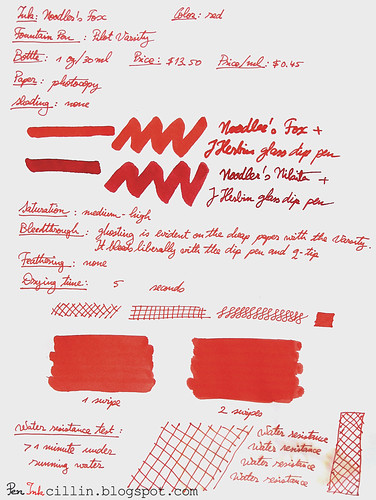
Ah, Noodler's Fox Red, an ink that I wanted to test for a very long time. Its turn has finally come. Being a red ink, I didn't have much use for it, except in my red fountain pen that I use at work. I use red mostly to underline stuff and make small notes so it takes a long time before I exhaust the pen's supply. As usual, I use yet another Pilot Varsity for my red inks.

I didn't buy a full bottle of Fox, but merely a sample. It's just as well, because this ink is expensive. What makes it so special though? Read on to find out.

Bottle
Fox Red is one of the few (and exclusive) inks that come in Noodler's dainty little 1oz (30ml) bottles. The bottle itself costs the same as a 3oz bottle, $13.50, which actually makes it 3 times more expensive than one of Noodler's regular inks, at $0.45 per milliliter. Nathan Tardiff, Noodler's creator and owner, opted for this solution to keep the ink relatively affordable.

But why is this ink so expensive? I tested another ink in this series, Hunter Green, but there's also La Reine Mauve, Luxury Blue, Periwinkle and Whiteness of the Whale. The simple answer is that the components which go into these inks are very expensive. I don't doubt that for a minute because Noodler's is known for its wide range of inexpensive inks but sometimes there are exceptions.

Color and saturation
Fox Red has a very... foxy color. Forgive the pun but it is rather deceiving. I wouldn't call it a pure red by any stretch of the imagination. Instead, it is warm, tending a bit towards orange. Overall it feels a bit vermilion if you ask me.

In the writing sample I compared it to Noodler's Nikita (of which I own a bottle). The two inks are very different, both in shade and in their properties. While Nikita is red-pink, Fox is red-orange.

Shading
Noodler's Fox Red doesn't have any shading. It is a flat color. Incidentally, the liquid is milky and rather opaque.

Feathering
I haven't noticed any feathering.

Bleedthrough
It ghosts strongly on cheap paper (but not on Rhodia) but it doesn't yet bleed through. Both sides of the paper remain usable. With the dip pen it bleeds copiously but then again, most inks do.

Flow and lubrication
Noodler's Fox Red flows well in the Pilot Varsity. I would easily give it a 6/10. On the other hand, it feels just a tiny bit dry. It's hard to describe exactly but to me it seems that the chalky nature of this ink has something to do with this. It still writes very well but it doesn't glide as well as, say, Bad Blue Heron that impressed me so much.

Drying time
Drying times are brisk on both Rhodia 80g and photocopy. While on Rhodia is requires just a little over 10 seconds, on photocopy it is dry within 5 seconds.

Smearing when dry
None.

Water resistance
I saved the best for last. I didn't breathe a word about this until now but Noodler's Fox is a water resistant red ink. While this may not seem very special, consider the fact that there aren't many waterproof red inks out there. In fact, there isn't another I can think of off the top of my head. This, alone, may be what makes Noodler's Fox so special, and may also provide an answer as to why it costs so much. As you can see from the sample, the water resistance is exemplary. But wait, there's more! Noodler's Fox is also forgery resistant, which means that you can use it to write important and/or official documents.

Conclusion
Taken separately, none of Noodler's Fox's features stands out. But together, it makes for a very compelling package. While it behaves well in most aspects, the most important feature is its water resistance. I don't know of another red ink that is also forgery resistant to boot. If you do, please drop me a line. If this is a definite requirement for your red ink, Noodler's Fox is a buy. If you can live without water resistance, there are other, much cheaper, inks out there. Then again, even if you buy it purely for its color, you can't go wrong with Noodler's Fox.

Following are two writing samples on photocopy and Rhodia 80g paper, respectively.

Noodler's Fox Red on photocopy

Noodler's Fox Red on Rhodia

Sailor Jentle Grenade ink review

$
0
0
I love testing new inks but reviewing a new brand altogether can be even more exciting. So is the case with my first ink from Sailor, Jentle Grenade. Once again, this is just a sample that I picked up to review, and not a full bottle. I will admit that the name of this ink is rather peculiar. "Jentle Grenade" sounds like an oxymoron, unless "Jentle" has nothing to do with "Gentle". Apparently the word "Grenade" comes from pomegranate and I can see how that would make sense, considering some of the seeds mimic the color of this ink.

Speaking of color, Goulet Pens (from where I bought the sample, no affiliation yada yada) categorizes it under "burgundy" so I will do the same. I really can't put it under red, nor purple, nor brown.

Because I had a feeling this ink might be interesting, I decided to use it in my TWSBI Diamond 530 with a broad nib unit. This is still my best fountain pen so it made sense to pair it with Sailor's ink. Without further ado, let's dig right into my impressions of this ink.

Bottle
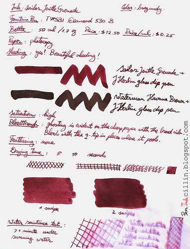
My sample only holds 2ml of ink but if you were to buy a whole bottle you would get 50ml or 1.7oz for $12.50. At $0.25 per milliliter, this is one of the more expensive inks but I find it worth the price.

Color and saturation
As I already mentioned, Sailor Jentle Grenade is a deep dark burgundy, somewhere between red and purple. I'm not a wine drinker but it reminds me of it. The saturation is also high. On the photocopy sample I compared this ink with Waterman Havana Brown which also has a very lovely brown color with hints of red. Unfortunately it isn't a very apt comparison because the color of the two inks differs greatly.

Shading
Sailor Jentle Grenade has some of the best shading I've seen in an ink. It is definitely on par with the other awesome ink I tested (and incidentally the one I used as comparison on the sample), Waterman Havana Brown. Layering the ink also shows varying shades of intensity. The shading is very nice and apparent when used with the broad nib of the TWSBI.

Feathering
None that I could notice.

Bleedthrough
While most inks tend to bleed through the cheap photocopier paper when applied with a q-tip, and Jentle Grenade is no exception, it merely ghosts a little when used with a pen. This is expected behavior considering how dark and saturated the ink is. It doesn't bleed or ghost on Rhodia.

Flow and lubrication
I prefer wet flowing inks and although Sailor Jentle Grenade flows well, I'm not 100% satisfied. I have a suspicion it might have something to do with the TWSBI, whose flow is known to be a little dry. I'd give it a 6-6.7 / 10 but I would prefer an 8/10. Either way, this isn't something that kills my enjoyment of the ink.

Drying time
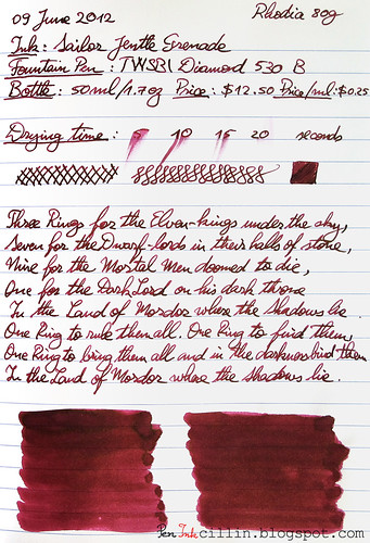
Here's where the performance of Jentle Grenade varies quite a lot depending on the type of paper used. With cheap, spongy copy paper, it dries quickly, a little over 5 seconds. With the high quality, glossy Rhodia 80g it takes up to 20 seconds. Bear in mind that this is using a broad nib which puts more ink to the paper. Still, even 20 seconds is not too bad, if you know what to expect and give it a little time to dry.

Smearing when dry
None.

Water resistance
I love it when an ink manages to sneak in a bonus feature. While this ink isn't labeled waterproof (to my knowledge), it seems to be a lot more water resistant than most regular inks. Holding it for over a minute under running water managed to make a mess of things but didn't completely wipe it off the paper. The writing is still legible. Notice though how Jentle Grenade sheds its layers when exposed to water. It seems that this ink has red and blue components. The blue component is more water resistant than the red which is the first to wash off. It's a very interesting behavior but it still doesn't make it a waterproof ink.

Conclusion
Jentle Grenade represents my first successful foray into Sailor's line of inks. The color and saturation are beautiful and the shading is gorgeous. It flows well in my fountain pen and it's a pleasure to write with. Hey, you might even get away with using it in a formal setting. As an added bonus, the little water resistance it has can save your precious writings in a pinch. Don't let the slightly higher price detract you. If you like this particular shade of ink, Sailor Jentle Grenade is a definite buy!

Following are the two samples on photocopy and Rhodia 80g paper, respectively.

Sailor Jentle Grenade on photocopy

Sailor Jentle Grenade on Rhodia
Viewing all 82 articles
Browse latest View live